You know what Mickey Mouse looks like, right? Little guy,
big ears?
Truth be told, Disney's corporate symbol has a lot of
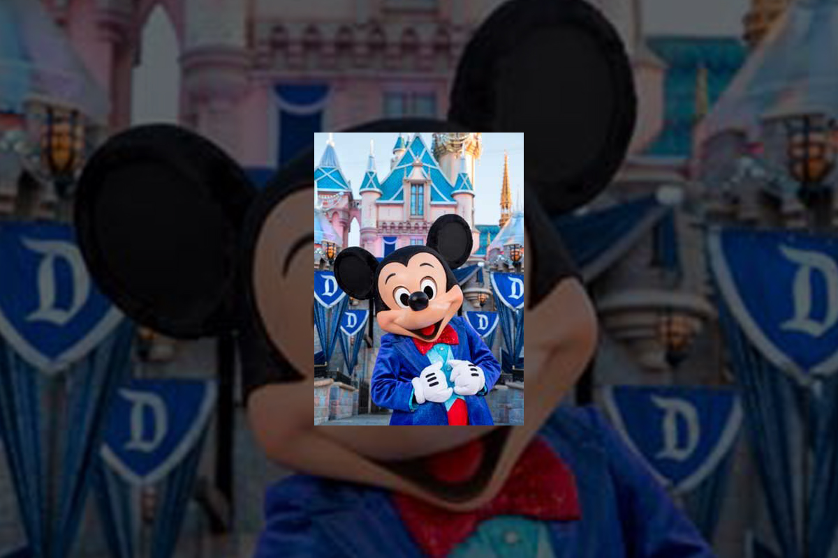
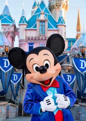
different looks. If Mickey's interacting with Guests at Disneyland
Park (especially this summer, when
the Happiest Place on Earth
is celebrating its 60th anniversary), he looks & dresses like this.

Copyright Disney Enterprises,
Inc.
All rights reserved
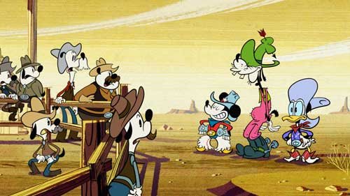
Or when he's appearing in one of those Emmy Award-winning shorts that Disney
Television Animation has produced (EX: "Bronco Busted," which debuts
on the Disney Channel tonight at 8 p.m. ET / PT), Mickey is drawn in a such a
way that he looks hip, cool, edgy & retro all at the same time.

Copyright Disney Enterprises, Inc. All rights
reserved
Looking ahead to 2017 now, when Disney Junior rolls out "Mickey and the
Roadster Racers," this brand-new animated series will feature a sportier version
of Disney's corporate symbol. One that Mouse House managers hope will persuade
preschool boys to more fully embrace this now 86 year-old character.

Copyright Disney Enterprises,
Inc. All rights reserved
That's what most people don't realize about the Mouse. The
Walt Disney Company deliberately tailors Mickey's look, even his style of
movement, depending on what sort of project / production he's appearing in.
Take — for example — Disney
California Adventure
Park's "World of Color:
Celebrate!" Because Disney's main mouse would be co-hosting this new
nighttime lagoon show with ace emcee Neil Patrick Harris, Eric Goldberg really had
to step up Mickey's game. Which is why this master Disney animator created
several minutes of all-new Mouse animation which then showed that Mickey was
just as skilled a showman as Neil was.

Copyright Disney Enterprises,
Inc.
All rights reserved
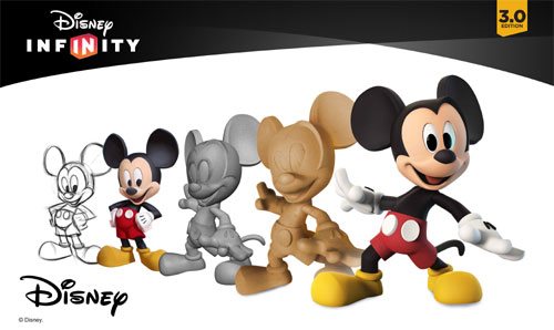
Better yet, let's take a look at what the folks at Avalanche Studios just went
through as they attempted to create a Classic version of Mickey & Minnie.
One that would then allow this popular pair to become part of Disney Infinity
3.0.
"I won't lie to you. We were under a lot of pressure to
get the look of this particular version of Mickey — he's called Red Pants
Mickey around here — just right," said Jeff Bunker, the VP of Art
Development at Avalanche Studios, during a recent phone interview. "When
we brought Sorcerer Mickey into Disney Infinity 1.0 back in January of 2014,
that one was relatively easy because … Well, everyone knows what Mickey Mouse
looked like when he appeared in 'Fantasia.' "

Copyright Disney Enterprises,
Inc. All rights reserved
"But this time around, we were being asked to design
THE Mickey & Minnie," Bunker continued. "And given that these Classic
Disney characters have been around in various different forms for the better
part of the last century … Well, which look was the right look?"
Which is why Jeff and his team at Avalanche Studios began watching hours &
hours of Mickey Mouse shorts. As they tried to get a handle on which look would
work best for these characters in Disney Infinity 3.0.

Copyright Disney
Enterprises, Inc. All rights reserved
"And we went all the way back to the very start of Mickey's career. We began
with 'Steamboat Willie' and then watched all of those black & white Mickey shorts
that Walt made back in the late 1920s & early 1930s. From there, we
transitioned to his Technicolor shorts. Which is when Mickey went from being
this pie-eyed, really feisty character to more of a well-behaved leading
man," Bunker recalled. "We then finished out our Mouse marathon by
watching all of those new Mickey shorts that Paul Rudish & his team have
been creating for Disney Television Animation. Those cartoons really recapture
a lot of the spirit and wild slapstick fun that Mickey's early, black &
white shorts had."
But given that the specific assignment that Avalanche Studios had been handed
was to create the most appealing looking, likeable version of Mickey Mouse
possible … In the end, Jeff and his team wound up borrowing bits & pieces
from a lot of different versions of the world's most famous mouse. So that
Classic Mickey would then look & move in a way that best fit the sort of
gameplay which people would soon be able to experience with Disney Infinity
3.0.

Copyright Disney Enterprises,
Inc. All rights reserved
"That — in a lot of ways — was actually the toughest
part of the Classic Mickey design project. You have to remember that one of the
key creative conceits of Disney Infinity
is that all the characters which appear in this game are toys," Bunker
stated. "Okay. So they're beautifully detailed, highly stylized toy
versions of beloved Disney, Pixar, Marvel & Lucasfilm characters. But
they're still supposed to be toys. So our Classic versions of Mickey &
Minnie have the same sort of thickness & sturdiness to them that toys have.
So that they'll then be able to fit right in with all of the rest of the
characters that Avalanche Studios had previously designed for Disney Infinity."
And then there was the matter of coming up with just the
right pose for Classic Mickey & Minnie. Which — to hear Jeff tell the
story — involved input from a lot of Disney upper management.

Copyright Disney Enterprises,
Inc. All rights reserved
"Everyone within the Company seemed to have an opinion
about how Mickey & Minnie should be posed. More to the point, if you Google
Mickey, you then discover that there are literally thousands of poses out there
for these two. Though — truth be told — a lot of those kind of play off the
way Mickey poses when he's being Disney's corporate symbol," Bunker said.
"But what I was most concerned about was that Mickey's pose had to work
with Minnie's pose. Because we were bringing the Classic versions of these
characters up into Disney Infinity 3.0 at the exact same time. And we wanted to
make sure — especially for those fans who like to put their Disney Infinity
figures on display — that Mickey's pose would then complement Minnie.
Which is why Jeff & the crew at Avalanche Studios
decided — when it came to Classic Mickey & Minnie's pose — that they
should go all the way back to the beginning. Which is why these two Disney icons
are sculpted in such a way that it almost seems as though you're witnessing the
very first time Mickey set eyes on Minnie.

Copyright Disney Enterprises,
Inc. All rights reserved
"And what was really great about that was — as soon as
we began showing people within the Company this pose — everyone at Disney
quickly got on board with the idea. I mean, the Classic Mickey that we sculpted
for Disney Infinity 3.0 is clearly a very playful, spunky character. But at the
same time, he's obviously got eyes for Minnie," Bunker concluded. "So
in the end, we were able to come up with Classic versions of these characters
that will work well within the creative confines of Disney Infinity 3.0 but at
the same time please those Disney fans who just collect these figures because
they like the way the Disney Infinity characters look."
So now that this particular design project is over, does
Jeff regret that Mouse House upper management was so hands-on when it came to
making sure that the Classic versions of Mickey & Minnie were specifically
tailored to fit the look & style of gameplay found in Disney Infinity 3.0?

Copyright Lucasfilm / Disney
Enterprises, Inc. All rights reserved
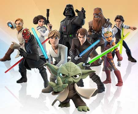
"To be blunt, we go through this every time we add a new character to the
game. The folks at Lucasfilm were just as hands-on when we were designing the
versions of Darth Vader and Yoda that will also soon be appearing in Disney
Infinity 3.0," Bunker laughed. "So in the end, if the character's
creators AND the fans are happy, then I'm happy."
This article was originally posted on the Huffington Post's Entertainment page on Tuesday, June 9, 2015


