General
Straight from Disney’s drawing board: The retro Mickey radio
Today's guest writer — A. Nonymouse — shares a story about a cool proposed Disney consumer product that never quite made it into production.

When it comes to merchandise, the Mouse Factory churns out some pretty nice stuff, don't you think? Like all of those great limited edition pieces that the nice folks at DisneyDirect.com created for Disneyland's 50th. Those were cool, weren't they?
But sometimes — no matter how cool an idea for a proposed Disney product might be — it can still slip through the cracks. This is the story of one such product. Which (as of this moment) isn't actually in production. But — with luck — may one day be available for purchase.
Do you remember those Mickey Mouse phones that everyone had back in the 1970s? You know, the one with the retro-style Mickey? Where the Mouse — in his red shorts and yellow shoes — stood with one gloved hand on his stomach while the other hand held the receiver? Did you ever own one of those? Was it the phone with the rotary dial with gold trim? Yeah? Boy, now you're really dating yourself.
Anyway … Those phones were a lot of fun. More to the point, they were very popular with Disneyana fans. Which is why — about a decade ago — a Disney designer (Let's call him Larry) got to thinking about those old phones. He wondered what other sorts of consumer products could be reworked in the style of those phones … When Larry hit upon the idea of a radio.
Copyright, Disney Enteprises, Inc.
So this designer quickly roughed out a proposal of a Mickey Mouse-shaped radio. In which Mickey's ears were the speakers, the Mouse's tail was the cord and the buttons on his old shorts would be the radio's dials. Then Larry started talking to everybody within earshot about how cool a retro Mickey radio would be. People with Larry's departent would nod & smile in agreement, saying things like "That's a pretty good idea." But — to be honest — that's as far as this project got for a while.
Then one day, Larry shared his retro Mickey radio idea to another Disney designer (Let's call him Curly). Curly was so impressed with Larry's idea that he quickly sat down and drew a couple of sketches of what this product might look like.
Only — instead of having Mickey stand up, just as he did with the phone — Curly drew the Mouse in a seated position. Having Mickey lean on his arms like you do if you're sitting on the floor. And Larry & Curly are talking about these sketches when Moe (Yet another Disney designer) comes along, sees the art and decides that he too really loves this idea. Which is why he immediately volunteers to turn Curly's sketches into a turn-around.
Copyright, Disney Enterprises, Inc.
For those of you who don't know: A turn-around is something that you created when you're designing a three dimensional product. These drawings show the product from all sides so that everyone who works on this project can then know just what the finished version is supposed to look like.
Now these three stoog… um, designers … were excited. They take this art and take it to their managers. Who — in turn — take this art to their managers. Who all nod their head in agreement, saying things like "This is a good idea," "This product will make the company some money" and "This has got to gte made."
But here's the interesting thing. After all that initial good buzz about the retro Mickey radio, the product never gets made.
To borrow a Jim Hill-ism, why for? Because … Well, you have to remember that the Walt Disney Company isn't actually a manufacturer. So — while the corporation's designers can come up with cool ideas like this retro Mickey radio — Disney still then has to find a company who's actually willing to build this product.
And — for something's that as ornate and elaborate as this retro Mickey radio is — that means that a mold must be made. And a mold for something that's this size (around 18 inches high or so) requires thousands of dollars to create. More importantly, the assembly line work that would be required to manufacture a piece like this is specialized. So the number of companies that you can sell an idea like this to is limited.
And — finally — the most obvious reason that a product like this never actually makes it into production is … Well … People at Disney Consumer Products sometimes err on the side of caution. Which (I guess) I can understand. After all, no one wants to be the guy who championed a brand new product, only to have that product not sell.
Copyright, Disney Enterprises, Inc.
So take a good look at the illustrations that accompany this article. Then think long and hard.
I mean, sure, this retro Mickey radio looks cute. And — what with you being a JHM reader and all — you'd probably buy one of these.
But then ask yourself: Are there fifteen thousand other buyers out there on the planet? People who'd be willing to buy enough retro Mickey radios so that this new product could then recover its tooling & marketing costs and eventually make a profit?
Can you answer that question? I can't. Nor could Larry, Moe and Curly. Which is why this retro Mickey radio remains on Disney's drawing board.
Which is admittedly kind of maddening. By that I mean: Here's what looks to be a sure-fire idea for Disney Consumer Products. But because no one can be sure that it's really a sure-fire idea, the retro Mickey radio never actually made it into production.
But — on the other hand — were someone in power at the Walt Disney Company to actually see these drawings and think "Hey, that looks like a really cool consumer product" … Maybe this 10-year retro Mickey radio idea might finally get another shot at moving from concept drawing to finished product.
But could that actually happen? One wonders — what with the rise in popularity of satellite radio — whether there now might actually be a market for a product like this? Something that stashes all of that cutting-edge technology inside of a friendly looking form?
All I can tell you guys is: Stay tuned. The retro Mickey radio story may not be over yet …
General
Seward Johnson bronzes add a surreal, artistic touch to NYC’s Garment District
Greetings from NYC. Nancy and I drove down from New
Hampshire yesterday because we'll be checking out
Disney Consumer Products' annual Holiday Showcase later today.
Anyway … After checking into our hotel (i.e., The Paul.
Which is located down in NYC's NoMad district), we decided to grab some dinner.
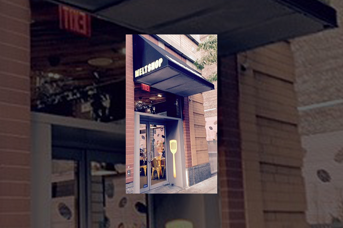
Which is how we wound up at the Melt Shop.

Photo by Jim Hill
Which is this restaurant that only sells grilled cheese sandwiches.
This comfort food was delicious, but kind of on the heavy side.

Photo by Jim Hill
Which is why — given that it was a beautiful summer night
— we'd then try and walk off our meals. We started our stroll down by the Empire
State Building
…
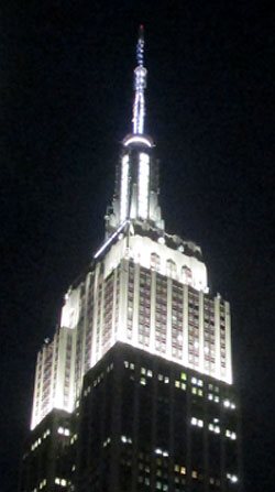
Photo by Jim Hill
… and eventually wound up just below Times
Square (right behind where the Waterford Crystal Times Square New
Year's Eve Ball is kept).

Photo by Jim Hill
But you know what we discovered en route? Right in the heart
of Manhattan's Garment District
along Broadway between 36th and 41st? This incredibly cool series of life-like
and life-sized sculptures that Seward
Johnson has created.

Photo by Jim Hill
And — yes — that is Abraham Lincoln (who seems to have
slipped out of WDW's Hall of Presidents when no one was looking and is now
leading tourists around Times Square). These 18 painted
bronze pieces (which were just installed late this past Sunday night / early
Monday morning) range from the surreal to the all-too-real.
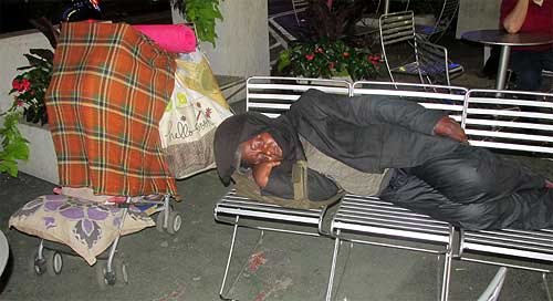
Photo by Jim Hill
Some of these pieces look like typical New Yorkers. Like the
business woman planning out her day …

Photo by Jim Hill
… the postman delivering the mail …

Photo by Jim Hill
… the hot dog vendor working at his cart …

Photo by Jim Hill
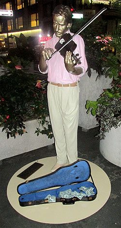
Photo by Jim Hill
… the street musician playing for tourists …

Photo by Jim Hill
Not to mention the tourists themselves.
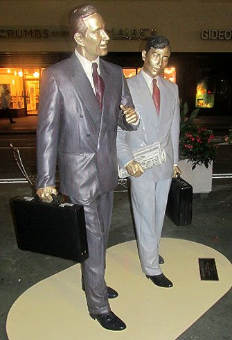
Photo by Jim Hill
But right alongside the bronze businessmen …

Photo by Jim Hill
… and the tired grandmother hauling her groceries home …
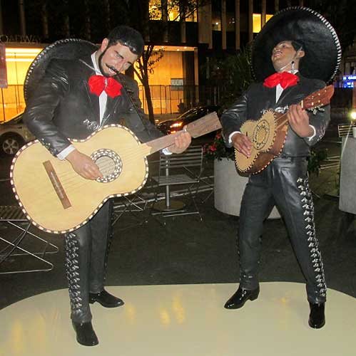
Photo by Jim Hill
… there were also statues representing people who were
from out-of-town …

Photo by Jim Hill
… or — for that matter — out-of-time.

Photo by Jim Hill
These were the Seward Johnson pieces that genuinely beguiled. Famous impressionist paintings brought to life in three dimensions.

Note the out-of-period water bottle that some tourist left
behind. Photo by Jim Hill
Some of them so lifelike that you actually had to pause for
a moment (especially as day gave way to night in the city) and say to yourself
"Is that one of the bronzes? Or just someone pretending to be one of these
bronzes?"
Mind you, for those of you who aren't big fans of the
impressionists …

Photo by Jim Hill
… there's also an array of American icons. Among them
Marilyn Monroe …
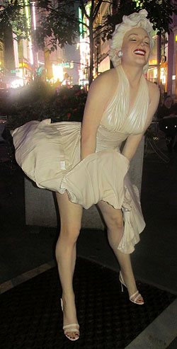
Photo by Jim Hill
… and that farmer couple from Grant Wood's "American
Gothic."

Photo by Jim Hill
But for those of you who know your NYC history, it's hard to
beat that piece which recreates Alfred Eisenstaedt's famous photograph of V-J Day in Times Square.

Photo by Jim Hill
By the way, a 25-foot-tall version of this particular Seward
Johnson piece ( which — FYI — is entitled "Embracing Peace") will actually
be placed in Times Square for a few days on or around August 14th to commemorate the 70th
anniversary of Victory Over Japan Day (V-J Day).

Photo by Jim Hill
By the way, if you'd like to check these Seward Johnson bronzes in
person (which — it should be noted — are part of the part of the Garment
District Alliance's new public art offering) — you'd best schedule a trip to
the City sometime over the next three months. For these pieces will only be on
display now through September 15th.
General
Wondering what you should “Boldly Go” see at the movies next year? The 2015 Licensing Expo offers you some clues
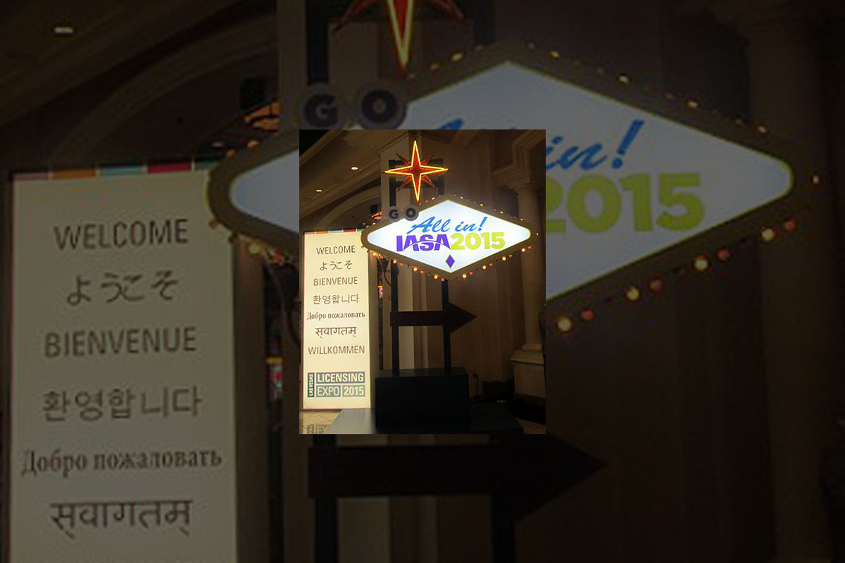
Greeting from the 2015 Licensing Expo, which is being held
at the Mandalay Bay
Convention Center in Las
Vegas.

Photo by Jim Hill
I have to admit that I enjoy covering the Licensing Expo.
Mostly becomes it allows bloggers & entertainment writers like myself to
get a peek over the horizon. Scope out some of the major motion pictures &
TV shows that today's vertically integrated entertainment conglomerates
(Remember when these companies used to be called movie studios?) will be
sending our way over the next two years or so.
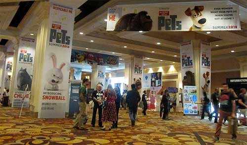
Photo by Jim Hill
Take — for example — all of "The Secret Life of
Pets" banners that greeted Expo attendees as they made their way to the
show floor today. I actually got to see some footage from this new Illumination
Entertainment production (which will hit theaters on July 8, 2016) the last time I was in Vegas. Which
was for CinemaCon back in April. And the five or so minutes of film that I viewed
suggested that "The Secret Life of Pets" will be a really funny
animated feature.

Photo by Jim Hill
Mind you, Universal Pictures wanted to make sure that Expo
attendees remembered that there was another Illumination Entertainment production
coming-to-a-theater-near-them before "The Secret Life of Pets" (And
that's "Minions," the "Despicable Me" prequel. Which
premieres at the Annecy International Animated Film Festival next week but
won't be screened stateside 'til July 10th of this year). Which is why they had
three minions who were made entirely out of LEGOS loitering out in the lobby.

Photo by Jim Hill
And Warner Bros. — because they wanted "Batman v
Superman: Dawn of Justice" to start trending on Twitter today — brought
the Batmobile to Las Vegas.
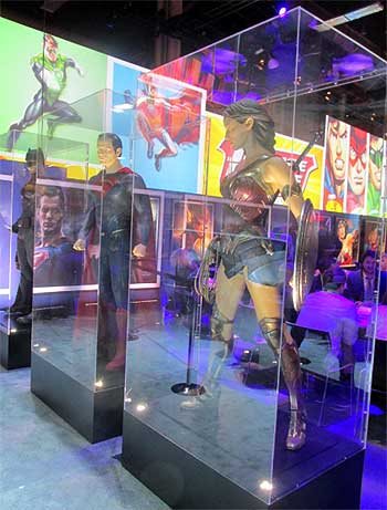
Photo by Jim Hill
Not to mention full-sized macquettes of Batman, Superman and
Wonder Woman. Just so conventioneers could then see what these DC superheroes
would actually look like in this eagerly anticipated, March 25, 2016 release.

Photo by Jim Hill
That's the thing that can sometimes be a wee bit frustrating
about the Licensing Expo. It's all about delayed gratification. You'll come
around a corner and see this 100 foot-long ad for "The Peanuts Movie"
and think "Hey, that looks great. I want to see that Blue Sky Studios production
right now." It's only then that you notice the fine print and realize that
"The Peanuts Movie" doesn't actually open in theaters 'til November
6th of this year.

Photo by Jim Hill
And fan of Blue Sky's "Ice Age" film franchise are in for an even
longer wait. Given that the latest installment in that top grossing series
doesn't arrive in theaters 'til July
15, 2016.

Photo by Jim Hill
Of course, if you're one of those people who needs immediate
gratification when it comes to your entertainment, there was stuff like that to
be found at this year's Licensing Expo. Take — for example — how the WWE
booth was actually shaped like a wrestling ring. Which — I'm guessing — meant
that if the executives of World Wrestling Entertainment, Inc. didn't like
the offer that you were making, they were then allowed to toss you out over the
top rope, Royal Rumble-style.

Photo by Jim Hill
I also have to admit that — as a longtime Star Trek fan —
it was cool to see the enormous Starship Enterprise that hung in place over the
CBS booth. Not to mention getting a glimpse of the official Star Trek 50th
Anniversary logo.
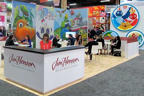
Photo by Jim Hill
I was also pleased to see lots of activity in The Jim Henson
Company booth. Which suggests that JHC has actually finally carved out a
post-Muppets identity for itself.

Photo by Jim Hill
Likewise for all of us who were getting a little concerned
about DreamWorks Animation (what with all the layoffs & write-downs &
projects that were put into turnaround or outright cancelled last year), it was
nice to see that booth bustling.

Photo by Jim Hill
Every so often, you'd come across some people who were
promoting a movie that you weren't entirely sure that you actually wanted to
see (EX: "Angry Birds," which Sony Pictures Entertainment / Columbia
Pictures will be releasing to theaters on May 20, 2016). But then you remembered that Clay Kaytis —
who's this hugely talented former Walt Disney Animation Studios animator — is
riding herd on "Angry Birds" with Fergal Reilly. And you'd think
"Well, if Clay's working on 'Angry Birds,' I'm sure this animated feature
will turn out fine."

Photo by Jim Hill
Mind you, there were reminders at this year's Licensing Expo
of great animated features that we're never going to get to see now. I still
can't believe — especially after that brilliant proof-of-concept footage
popped up online last year — that Sony execs decided not to go forward
with production of Genndy Tartakovsky's
"Popeye" movie. But that's the
cruel thing about the entertainment business, folks. It will sometime break
your heart.
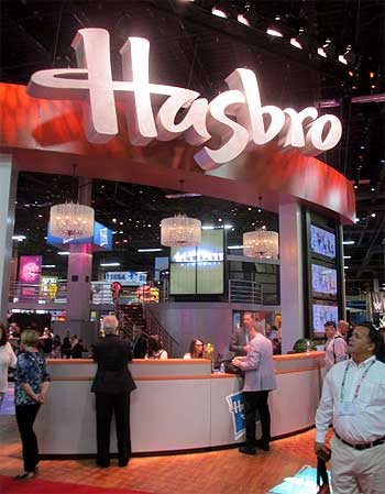
Photo by Jim Hill
And make no mistake about this. The Licensing Expo is all
about business. That point was clearly driven home at this year's show when —
as you walked through the doors of the Mandalay
Bay Convention Center
— the first thing that you saw was the Hasbros Booth. Which was this gleaming,
sleek two story-tall affair full of people who were negotiating deals &
signing contracts for all of the would-be summer blockbusters that have already
announced release dates for 2019 & beyond.

Photo by Jim Hill
"But what about The Walt Disney Company?," you
ask. "Weren't they represented on the show floor at this year's Licensing
Expo?" Not really, not. I mean, sure. There were a few companies there hyping
Disney-related products. Take — for example — the Disney Wikkeez people.
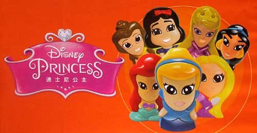
Photo by Jim Hill
I'm assuming that some Disney Consumer Products exec is
hoping that Wikkeez will eventually become the new Tsum Tsum. But to be blunt,
these little hard plastic figures don't seem to have the same huggable charm
that those stackable plush do. But I've been wrong before. So let's see what
happens with Disney Wikkeez once they start showing up on the shelves of the
Company's North American retail partners.

Photo by Jim Hill
And speaking of Disney's retail partners … They were
meeting with Mouse House executives behind closed doors one floor down from the
official show floor for this year's Licensing Expo.

Photo by Jim Hill
And the theme for this year's invitation-only Disney shindig? "Timeless
Stories" involving the Disney, Pixar, Marvel & Lucasfilm brands that
would then appeal to "tomorrow's consumer."

Photo by Jim Hill
And just to sort of hammer home the idea that Disney is no
longer the Company which cornered the market when it comes to little girls
(i.e., its Disney Princess and Disney Fairies franchises), check out this
wall-sized Star Wars-related image that DCP put up just outside of one of its
many private meeting rooms. "See?," this carefully crafted photo
screams. "It isn't just little boys who want to wield the Force. Little
girls also want to grow up and be Lords of the Sith."
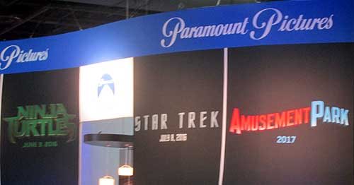
Photo by Jim Hill
One final, kind-of-ironic note: According to this banner,
Paramount Pictures will be releasing a movie called "Amusement Park"
to theaters sometime in 2017.

Photo by Jim Hill
Well, given all the "Blackfish" -related issues
that have been dogged SeaWorld Parks & Entertainment over the past two years, I'm
just hoping that they'll still be in the amusement park business come 2017.
Your thoughts?
General
It takes more than three circles to craft a Classic version of Mickey Mouse
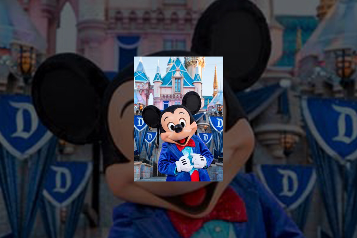
You know what Mickey Mouse looks like, right? Little guy,
big ears?
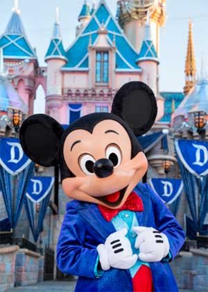
Truth be told, Disney's corporate symbol has a lot of
different looks. If Mickey's interacting with Guests at Disneyland
Park (especially this summer, when
the Happiest Place on Earth
is celebrating its 60th anniversary), he looks & dresses like this.
Copyright Disney Enterprises,
Inc.
All rights reserved
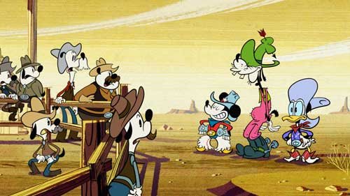
Or when he's appearing in one of those Emmy Award-winning shorts that Disney
Television Animation has produced (EX: "Bronco Busted," which debuts
on the Disney Channel tonight at 8 p.m. ET / PT), Mickey is drawn in a such a
way that he looks hip, cool, edgy & retro all at the same time.
Copyright Disney Enterprises, Inc. All rights
reserved
Looking ahead to 2017 now, when Disney Junior rolls out "Mickey and the
Roadster Racers," this brand-new animated series will feature a sportier version
of Disney's corporate symbol. One that Mouse House managers hope will persuade
preschool boys to more fully embrace this now 86 year-old character.

Copyright Disney Enterprises,
Inc. All rights reserved
That's what most people don't realize about the Mouse. The
Walt Disney Company deliberately tailors Mickey's look, even his style of
movement, depending on what sort of project / production he's appearing in.
Take — for example — Disney
California Adventure
Park's "World of Color:
Celebrate!" Because Disney's main mouse would be co-hosting this new
nighttime lagoon show with ace emcee Neil Patrick Harris, Eric Goldberg really had
to step up Mickey's game. Which is why this master Disney animator created
several minutes of all-new Mouse animation which then showed that Mickey was
just as skilled a showman as Neil was.

Copyright Disney Enterprises,
Inc.
All rights reserved
Better yet, let's take a look at what the folks at Avalanche Studios just went
through as they attempted to create a Classic version of Mickey & Minnie.
One that would then allow this popular pair to become part of Disney Infinity
3.0.
"I won't lie to you. We were under a lot of pressure to
get the look of this particular version of Mickey — he's called Red Pants
Mickey around here — just right," said Jeff Bunker, the VP of Art
Development at Avalanche Studios, during a recent phone interview. "When
we brought Sorcerer Mickey into Disney Infinity 1.0 back in January of 2014,
that one was relatively easy because … Well, everyone knows what Mickey Mouse
looked like when he appeared in 'Fantasia.' "

Copyright Disney Enterprises,
Inc. All rights reserved
"But this time around, we were being asked to design
THE Mickey & Minnie," Bunker continued. "And given that these Classic
Disney characters have been around in various different forms for the better
part of the last century … Well, which look was the right look?"
Which is why Jeff and his team at Avalanche Studios began watching hours &
hours of Mickey Mouse shorts. As they tried to get a handle on which look would
work best for these characters in Disney Infinity 3.0.

Copyright Disney
Enterprises, Inc. All rights reserved
"And we went all the way back to the very start of Mickey's career. We began
with 'Steamboat Willie' and then watched all of those black & white Mickey shorts
that Walt made back in the late 1920s & early 1930s. From there, we
transitioned to his Technicolor shorts. Which is when Mickey went from being
this pie-eyed, really feisty character to more of a well-behaved leading
man," Bunker recalled. "We then finished out our Mouse marathon by
watching all of those new Mickey shorts that Paul Rudish & his team have
been creating for Disney Television Animation. Those cartoons really recapture
a lot of the spirit and wild slapstick fun that Mickey's early, black &
white shorts had."
But given that the specific assignment that Avalanche Studios had been handed
was to create the most appealing looking, likeable version of Mickey Mouse
possible … In the end, Jeff and his team wound up borrowing bits & pieces
from a lot of different versions of the world's most famous mouse. So that
Classic Mickey would then look & move in a way that best fit the sort of
gameplay which people would soon be able to experience with Disney Infinity
3.0.

Copyright Disney Enterprises,
Inc. All rights reserved
"That — in a lot of ways — was actually the toughest
part of the Classic Mickey design project. You have to remember that one of the
key creative conceits of Disney Infinity
is that all the characters which appear in this game are toys," Bunker
stated. "Okay. So they're beautifully detailed, highly stylized toy
versions of beloved Disney, Pixar, Marvel & Lucasfilm characters. But
they're still supposed to be toys. So our Classic versions of Mickey &
Minnie have the same sort of thickness & sturdiness to them that toys have.
So that they'll then be able to fit right in with all of the rest of the
characters that Avalanche Studios had previously designed for Disney Infinity."
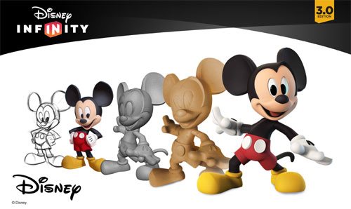
And then there was the matter of coming up with just the
right pose for Classic Mickey & Minnie. Which — to hear Jeff tell the
story — involved input from a lot of Disney upper management.
Copyright Disney Enterprises,
Inc. All rights reserved
"Everyone within the Company seemed to have an opinion
about how Mickey & Minnie should be posed. More to the point, if you Google
Mickey, you then discover that there are literally thousands of poses out there
for these two. Though — truth be told — a lot of those kind of play off the
way Mickey poses when he's being Disney's corporate symbol," Bunker said.
"But what I was most concerned about was that Mickey's pose had to work
with Minnie's pose. Because we were bringing the Classic versions of these
characters up into Disney Infinity 3.0 at the exact same time. And we wanted to
make sure — especially for those fans who like to put their Disney Infinity
figures on display — that Mickey's pose would then complement Minnie.
Which is why Jeff & the crew at Avalanche Studios
decided — when it came to Classic Mickey & Minnie's pose — that they
should go all the way back to the beginning. Which is why these two Disney icons
are sculpted in such a way that it almost seems as though you're witnessing the
very first time Mickey set eyes on Minnie.

Copyright Disney Enterprises,
Inc. All rights reserved
"And what was really great about that was — as soon as
we began showing people within the Company this pose — everyone at Disney
quickly got on board with the idea. I mean, the Classic Mickey that we sculpted
for Disney Infinity 3.0 is clearly a very playful, spunky character. But at the
same time, he's obviously got eyes for Minnie," Bunker concluded. "So
in the end, we were able to come up with Classic versions of these characters
that will work well within the creative confines of Disney Infinity 3.0 but at
the same time please those Disney fans who just collect these figures because
they like the way the Disney Infinity characters look."
So now that this particular design project is over, does
Jeff regret that Mouse House upper management was so hands-on when it came to
making sure that the Classic versions of Mickey & Minnie were specifically
tailored to fit the look & style of gameplay found in Disney Infinity 3.0?
Copyright Lucasfilm / Disney
Enterprises, Inc. All rights reserved
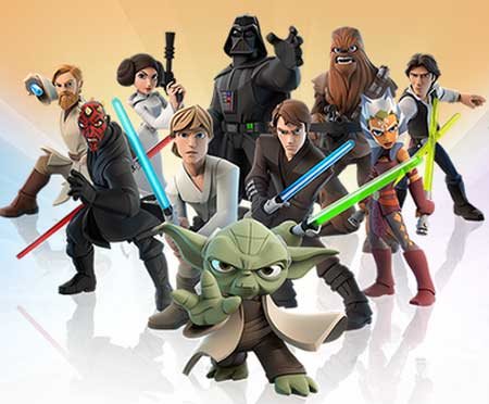
"To be blunt, we go through this every time we add a new character to the
game. The folks at Lucasfilm were just as hands-on when we were designing the
versions of Darth Vader and Yoda that will also soon be appearing in Disney
Infinity 3.0," Bunker laughed. "So in the end, if the character's
creators AND the fans are happy, then I'm happy."
This article was originally posted on the Huffington Post's Entertainment page on Tuesday, June 9, 2015
-

 Film & Movies11 months ago
Before He Was 626: The Surprisingly Dark Origins of Disney’s Stitch
-
 History9 months ago
California Misadventure
-
 Film & Movies10 months ago
The Best Disney Animation Film Never Made – “Chanticleer”
-

 Theme Parks & Themed Entertainment10 months ago
The ExtraTERRORestrial Files
-
 Television & Shows12 months ago
The Untold Story of Super Soap Weekend at Disney-MGM Studios: How Daytime TV Took Over the Parks
-

 History11 months ago
Why Disney’s Animal Kingdom’s Beastly Kingdom Was Never Built


