General
WDI’s X-Scream Makeover of WDW’s Haunted Mansion: Part 1
Jim Hill begins a new series that takes an in-depth look at this Magic Kingdom favorite. Which recently underwent a three-month-long overhaul that significantly enhanced many of the effects found in this Liberty Square attraction

Plussing. It’s a practice at the Disney theme parks that reportedly dates back to the late 1950s. When Walt — while he was visiting Disneyland one weekend — supposedly overheard a mother tell her child: “We don’t have to go on the Jungle Cruise again. We saw that ride the last time we visited this park.”
Ever since that time, the Imagineers (following the Ol’ Mousetro’s specific instructions) have made a habit of adding new figures & effects to already well-established rides, shows and attractions. With the hope that these “freshenings-up” will then give theme park visitors a compelling new reason to revisit an old favorite.
And when it comes to the Haunted Mansion at WDW’s Magic Kingdom … Well, it’s not like this Liberty Square favorite hasn’t ever been plussing in the past. Diehard fans of this dark ride will be glad to tell you about the haunted hearse that was added to the queue area back in 1997. Or — for that matter — the blinking Leota tombstone that went “live” in 2002. Or the Mr. Toad statue that appeared in this attraction’s post-show Pet Cemetery in 2005.
But as for the attraction itself … With the exception of those singing busts in the Graveyard sequence (Which — what with the technical upgrades that were made during this most recent redo — are now using fourth generation digital projection technology), the rest of the Haunted Mansion remained mired in the 1970s.
No. It was worse than that, actually. Many of the little touches that used to really add to this attraction’s charm (How many of you remember that cool blast of air that you used to feel just as the Ghost Host mentioned that the Mansion featured ” … hot and cold running chills” ?) had been broken for a decade or more. And given that — back in the 1990s — Mouse House management made significant cuts to WDW’s overall maintenance budget … The money just wasn’t there to make any significant repairs to this dark ride.
So the Mansion moldered for years. With the leak in the roof continually ruining the carpet in the attraction’s Foyer (You thought that that distinct whiff of mildew that you used to catch whenever you entered this show building was deliberate? Yet another application of that smellizer technology that the Imagineers first introduced at EPCOT Center back in 1982 ? Think again, folks. That moldy smell was real mold growing under the carpets and along the baseboards in the Haunted Mansion’s entrance area) and the attraction’s AA figures losing a lot of their original animation. All because …
Well, to be blunt, because many members of WDW management didn’t give a rat’s ass about this 36-year-old fan favorite. They preferred that the money that had been budgeted for Walt Disney World be spent on new rides & shows for the resort. Rather than being wasted on maintaining and/or upgrading already existing attractions.
Mind you, there were a few folks left at WDW who remembered the old ways. Particularly Walt’s belief that you should plus already established rides & shows. With the hope that these additions would then give the guests a pleasant surprise the next time they rode that particular attraction.
Which is why — for over five years now — these Disney insiders have been fighting for a Mansion redo. One that would not only restore this once state-of-the-art dark ride to its former glory, but also fold in a few new tricks along the way.
But the good news is … All of that nagging and noodging eventually paid off. With Mouse House managers ultimately agreeing to give the Imagineers $30 million to make some desperately needed repairs to the 36-year-old structure as well as upgrade the interior of this Liberty Square attraction.
Mind you, they then only gave WDI three months to get all of this work done. You see, WDW’s Haunted Mansion had to be back & running again by no later than September 13th of this year. “Why For that particular date ?,” you ask. Because if the Mansion wasn’t back on line by then, Disney then risked disappointing the thousands of people who had already purchased tickets to the very first night of Mickey’s Not-so-Scary Halloween Party. Which was scheduled for September 14, 2007.
Obviously, this was a very ambitious project with a nearly impossible deadline. But as Walt Disney once said: “It’s kind of fun to do the impossible.” So once the Mansion closed its doors back on June 7th, the Imagineers immediately got to work. And 95 days later, the construction walls came down to reveal … Well, not exactly ” … a disquieting metamorphosis.” But — rather — a newly enhanced version of an old WDW favorite.
Indeed, as one enters the outdoors portion of the queue for this Liberty Square attraction, one may find it difficult to put their finger on what exactly has been changed about the exterior of the Haunted Mansion. Oh, sure. The awning that covers the Colonnade is now blood red. Which does a much better job of matching the color of the brick that was used to build this Dutch Gothic-style manor house than the old green awning did. But — beyond that — things outside of this show building don’t look all that different.
Which is just WDI wants you to think. That there’s been no real changes made out here. That everything is as it ever was at Disney World’s Haunted Mansion.
Truth be told, some pretty significant work was done in the Colonnade area. First by widening the width of the queue. Which means that — for the first time ever — the exterior portion of the Haunted Mansion is now wheelchair accessible.
Secondly, by putting a third more of this attraction’s outside queue space undercover … Well, that means a couple of hundred more tourists are kept out of the elements — sheltered from that blistering Florida sun and/or those pounding afternoon rainstorms — while they wait for their chance to experience the Haunted Mansion.
Beyond that … The exterior of this dark ride (Even though it’s just been completely repainted) looks pretty much as it always has. Oh, sure. The dark paint that used to cover the door that you actually enter this show building through has been stripped away. It’s been replaced by a new stain & varnish that finally allows you see to see the wood grain underneath. But — again — we’re talking about mostly subtle changes. Things that casual visitors to this Liberty Square attraction won’t (and — to be honest — really shouldn’t) notice.
But once you enter the Haunted Mansion’s foyer area … Well, this is where Disney diehards and/or hardcore Mansion fans will really begin noticing the differences. Gone forever is that mildew smell. Not only did the Imagineers repair that roof leak, they also had new carpeting installed. The wallpaper that lines the upper third of the room is also new. And for the wood panel that cover the bottom 2/3rds … Just as they did with the door that leads into the Foyer area, WDI stripped all of the paint off of that paneling. They then covered this wood with a new dark strain as well as a clear coat of shellac. So that the natural wood grain in this area really pops.
Though I’d imagine — given what’s now going on with Master Gracey’s portrait over the fireplace — not all that many tourists are actually going to notice the popping wood grain in the paneling.
Gone are the days when this “Picture of Dorian Gray” effect used to be achieved by having two behind-the-scenes slide projectors working in perfect synchronization. Where — as each slide cross-faded into the next — we got to see the master of the house slowly deteriorate. Now Disney’s gone digital. And the crystal-clear image that you see in the portrait above the fire … Well, it now morphs from one painting to the next.
The end result is a much, much smoother effect. Where if you keep a close eye on this digital projection as the Ghost Host does his spiel, you can now see Master Gracey’s clothing shrink and fray. The flesh on his once youthful face melt away to reveal the grinning skull underneath.
Speaking of the Ghost Host … The Imagineers made a point of preserving Paul Frees‘ narration for the Haunted Mansion. Not changing a single syllable of what this Disney Legend says of the course of this much beloved attraction.
But that said … That doesn’t mean that the guys at WDI haven’t tried to improve on perfection. Frees’ voice tracks (Which were recorded back in 1969) were all first digitally remastered, then given a sinister sounding breathy undertone. Making it sound as if Paul really were speaking to us from another realm.
Next — thanks to the huge number of new speakers that the Imagineers installed as part of this most recent Mansion redo — the Ghost Host now literally sounds as if he’s moving unseen throughout the entire room. Floating just above our heads as the door to the Portrait Gallery (AKA the Stretching Room) slides open and Frees intones “Kindly step all the way in and make room for everyone. There’s no turning back now.”
It’s inside the Portrait Gallery that the audio enhancements that WDI has made to the Mansion really become obvious. Where once there were only 7 speakers, there are now over 70. With dozens of them hidden away in that new grillwork that’s been installed along the floor of the stretching room.
And some of the choices that the Imagineers have made here are just so smart … I mean — for over 36 years now — this chamber with “no windows and no doors” has been stretching, right? Well, if that’s really the case, then why is it that we’ve never heard the wood that makes up the Portrait Gallery creaking & groaning as this room undergoes its supernatural transformation? Well, now you can.
Add to this the selective use of Disney’s binaural sound system … Which can best be heard right after that lightning strike reveals the corpse that’s hanging just above the scrim in the Portrait Gallery. As thunder rolls and the stretching room plunges into darkness, you can then actually hear bats (Who have supposedly been frightened by the thunder & lightning) swooping down into the Portrait Gallery, trying to find their way out of the Mansion.
Mind you, not all of the audio effects that the Imagineers had originally proposed for this portion of the Haunted Mansion wound up making it into the finished version of the attraction. An earlier, much louder version of that lightning strike & the thunder rolling inside of the Portrait Gallery wound up getting scaled back. Mostly because the cast members who took part in early tests of this revamped Liberty Square attraction said that the first version was so loud and (and — because of all those new sub-woofers that are hidden in the grillwork around the base of the stretching room) felt so strong … Well, it nearly scared the crap out of them. Which is why the lightning-strike-and-thunder-roll audio effects that the Imagineers had originally proposed were scaled back by 50%.
And then there were the Gargoyles. Who — in this original version of the newly enhanced Portrait Gallery — were supposed to have a speaking role. According to the revised script for this sequence, every time the Ghost Host paused in his spiel, the Gargoyles would then chime in. Repeating the very last word or phrase that the Ghost Host just said.
Here’s an excerpt from the revised script for this sequence in the Haunted Mansion:
GHOST HOST: Is this haunted room actually stretching?
GARGOYLES: Stretching.
GHOST HOST: Or is it your imagination, hmmn? And consider this dismaying observation: This chamber has no windows and no doors …
GARGOYLES: No doors !
Sounds pretty cool, don’t you think? The only problem is — during those after-hours, cast-member-only tests that were done on the revamped Mansion — the Imagineers noticed that whenever the Gargoyles spoke, the people inside of the Portrait Gallery would then begin talking amongst themselves. Saying things like “Did you hear that? I think that the Gargoyles just talked.” Which — because of all thenew conversations that were suddenly springing up around the stretching room — then made it rather difficult to hear the Ghost Host’s next line.
Faced with the fact that this one audio enhancement (Which — thanks to the binaural technology that was used to deliver the Gargoyles’ dialogue into the Portrait Gallery — made it sound as if these long-silent statues were now speaking directly to you) unintentionally undermined the effectiveness of the rest of this classic sequence in the Haunted Mansion … The Imagineers reluctantly cut the Gargoyles’ speaking role. Except for one tiny little snippet that you can still hear toward the end of the stretching room scene.
Which is why you really want to linger in the Portrait Gallery after the doors have opened and the rest of the other guests are hurrying along the Entrance Hallway. As the Ghost Host says ” … and let’s all stay together, please,” you can hear the Gargoyles say “Stay together.” Which is then followed by this eerie child-like laughter that briefly bounces around the stretching room before it then fades away.
As we head down the Entrance Hallway (Which now features the exact wallpaper and wood treatments that we saw out in the Foyer of the Haunted Mansion. Which — in theory — then helps to unify the look & design of this whole part of the attraction), we hear the Ghost Host say ” … a carriage approaches to carry you into the boundless realm of the supernatural.”
And we will eventually get in that carriage and go explore the rest of this newly enhanced dark ride … But — in the next installment of JHM’s “X-Scream Makeover” series — we’re actually going to talk about the changes that the Imagineers made to the Mansion’s Omnimovers. Making this 36-year-old ride system safer & better sounding for all WDW visitors.
General
Seward Johnson bronzes add a surreal, artistic touch to NYC’s Garment District
Greetings from NYC. Nancy and I drove down from New
Hampshire yesterday because we'll be checking out
Disney Consumer Products' annual Holiday Showcase later today.
Anyway … After checking into our hotel (i.e., The Paul.
Which is located down in NYC's NoMad district), we decided to grab some dinner.
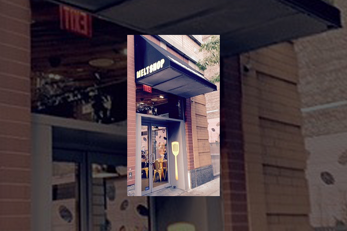
Which is how we wound up at the Melt Shop.

Photo by Jim Hill
Which is this restaurant that only sells grilled cheese sandwiches.
This comfort food was delicious, but kind of on the heavy side.

Photo by Jim Hill
Which is why — given that it was a beautiful summer night
— we'd then try and walk off our meals. We started our stroll down by the Empire
State Building
…
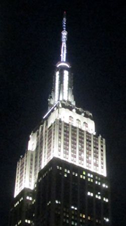
Photo by Jim Hill
… and eventually wound up just below Times
Square (right behind where the Waterford Crystal Times Square New
Year's Eve Ball is kept).

Photo by Jim Hill
But you know what we discovered en route? Right in the heart
of Manhattan's Garment District
along Broadway between 36th and 41st? This incredibly cool series of life-like
and life-sized sculptures that Seward
Johnson has created.

Photo by Jim Hill
And — yes — that is Abraham Lincoln (who seems to have
slipped out of WDW's Hall of Presidents when no one was looking and is now
leading tourists around Times Square). These 18 painted
bronze pieces (which were just installed late this past Sunday night / early
Monday morning) range from the surreal to the all-too-real.
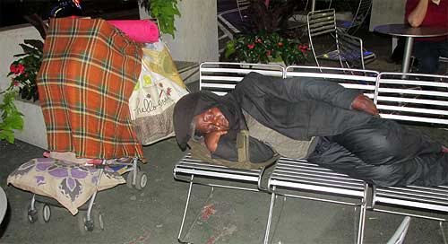
Photo by Jim Hill
Some of these pieces look like typical New Yorkers. Like the
business woman planning out her day …

Photo by Jim Hill
… the postman delivering the mail …

Photo by Jim Hill
… the hot dog vendor working at his cart …

Photo by Jim Hill
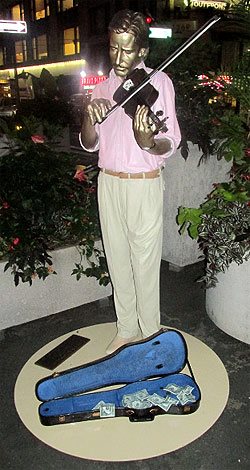
Photo by Jim Hill
… the street musician playing for tourists …

Photo by Jim Hill
Not to mention the tourists themselves.
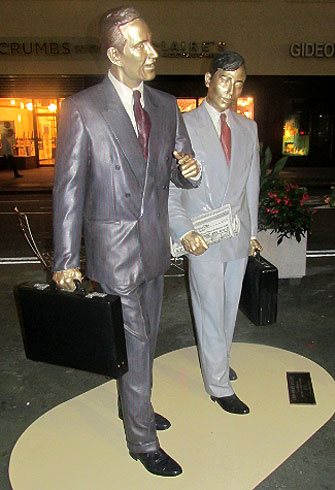
Photo by Jim Hill
But right alongside the bronze businessmen …

Photo by Jim Hill
… and the tired grandmother hauling her groceries home …
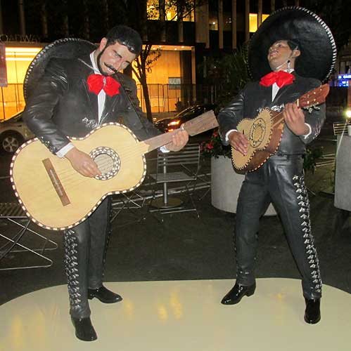
Photo by Jim Hill
… there were also statues representing people who were
from out-of-town …

Photo by Jim Hill
… or — for that matter — out-of-time.

Photo by Jim Hill
These were the Seward Johnson pieces that genuinely beguiled. Famous impressionist paintings brought to life in three dimensions.

Note the out-of-period water bottle that some tourist left
behind. Photo by Jim Hill
Some of them so lifelike that you actually had to pause for
a moment (especially as day gave way to night in the city) and say to yourself
"Is that one of the bronzes? Or just someone pretending to be one of these
bronzes?"
Mind you, for those of you who aren't big fans of the
impressionists …

Photo by Jim Hill
… there's also an array of American icons. Among them
Marilyn Monroe …
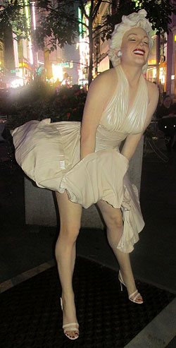
Photo by Jim Hill
… and that farmer couple from Grant Wood's "American
Gothic."

Photo by Jim Hill
But for those of you who know your NYC history, it's hard to
beat that piece which recreates Alfred Eisenstaedt's famous photograph of V-J Day in Times Square.

Photo by Jim Hill
By the way, a 25-foot-tall version of this particular Seward
Johnson piece ( which — FYI — is entitled "Embracing Peace") will actually
be placed in Times Square for a few days on or around August 14th to commemorate the 70th
anniversary of Victory Over Japan Day (V-J Day).

Photo by Jim Hill
By the way, if you'd like to check these Seward Johnson bronzes in
person (which — it should be noted — are part of the part of the Garment
District Alliance's new public art offering) — you'd best schedule a trip to
the City sometime over the next three months. For these pieces will only be on
display now through September 15th.
General
Wondering what you should “Boldly Go” see at the movies next year? The 2015 Licensing Expo offers you some clues
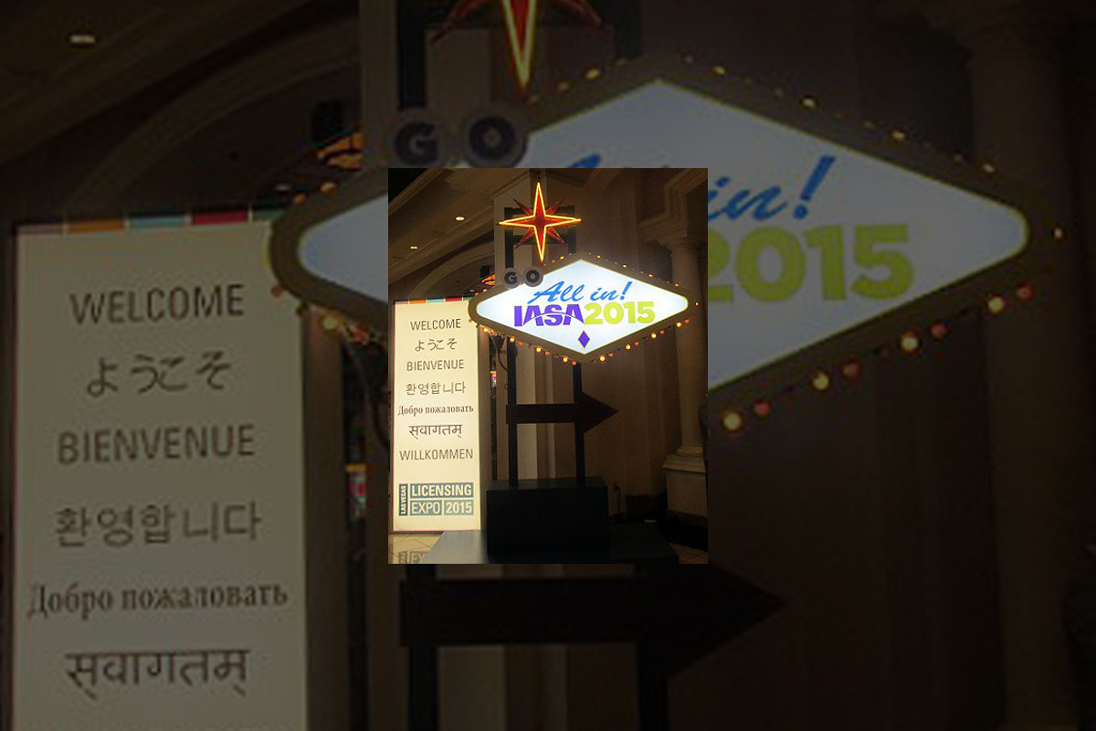
Greeting from the 2015 Licensing Expo, which is being held
at the Mandalay Bay
Convention Center in Las
Vegas.

Photo by Jim Hill
I have to admit that I enjoy covering the Licensing Expo.
Mostly becomes it allows bloggers & entertainment writers like myself to
get a peek over the horizon. Scope out some of the major motion pictures &
TV shows that today's vertically integrated entertainment conglomerates
(Remember when these companies used to be called movie studios?) will be
sending our way over the next two years or so.
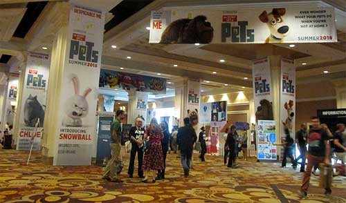
Photo by Jim Hill
Take — for example — all of "The Secret Life of
Pets" banners that greeted Expo attendees as they made their way to the
show floor today. I actually got to see some footage from this new Illumination
Entertainment production (which will hit theaters on July 8, 2016) the last time I was in Vegas. Which
was for CinemaCon back in April. And the five or so minutes of film that I viewed
suggested that "The Secret Life of Pets" will be a really funny
animated feature.

Photo by Jim Hill
Mind you, Universal Pictures wanted to make sure that Expo
attendees remembered that there was another Illumination Entertainment production
coming-to-a-theater-near-them before "The Secret Life of Pets" (And
that's "Minions," the "Despicable Me" prequel. Which
premieres at the Annecy International Animated Film Festival next week but
won't be screened stateside 'til July 10th of this year). Which is why they had
three minions who were made entirely out of LEGOS loitering out in the lobby.

Photo by Jim Hill
And Warner Bros. — because they wanted "Batman v
Superman: Dawn of Justice" to start trending on Twitter today — brought
the Batmobile to Las Vegas.
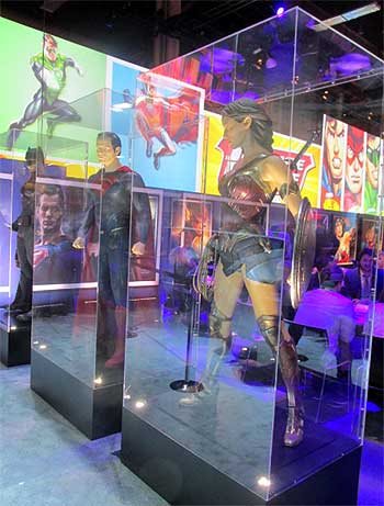
Photo by Jim Hill
Not to mention full-sized macquettes of Batman, Superman and
Wonder Woman. Just so conventioneers could then see what these DC superheroes
would actually look like in this eagerly anticipated, March 25, 2016 release.

Photo by Jim Hill
That's the thing that can sometimes be a wee bit frustrating
about the Licensing Expo. It's all about delayed gratification. You'll come
around a corner and see this 100 foot-long ad for "The Peanuts Movie"
and think "Hey, that looks great. I want to see that Blue Sky Studios production
right now." It's only then that you notice the fine print and realize that
"The Peanuts Movie" doesn't actually open in theaters 'til November
6th of this year.

Photo by Jim Hill
And fan of Blue Sky's "Ice Age" film franchise are in for an even
longer wait. Given that the latest installment in that top grossing series
doesn't arrive in theaters 'til July
15, 2016.

Photo by Jim Hill
Of course, if you're one of those people who needs immediate
gratification when it comes to your entertainment, there was stuff like that to
be found at this year's Licensing Expo. Take — for example — how the WWE
booth was actually shaped like a wrestling ring. Which — I'm guessing — meant
that if the executives of World Wrestling Entertainment, Inc. didn't like
the offer that you were making, they were then allowed to toss you out over the
top rope, Royal Rumble-style.

Photo by Jim Hill
I also have to admit that — as a longtime Star Trek fan —
it was cool to see the enormous Starship Enterprise that hung in place over the
CBS booth. Not to mention getting a glimpse of the official Star Trek 50th
Anniversary logo.
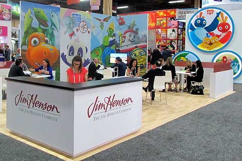
Photo by Jim Hill
I was also pleased to see lots of activity in The Jim Henson
Company booth. Which suggests that JHC has actually finally carved out a
post-Muppets identity for itself.

Photo by Jim Hill
Likewise for all of us who were getting a little concerned
about DreamWorks Animation (what with all the layoffs & write-downs &
projects that were put into turnaround or outright cancelled last year), it was
nice to see that booth bustling.

Photo by Jim Hill
Every so often, you'd come across some people who were
promoting a movie that you weren't entirely sure that you actually wanted to
see (EX: "Angry Birds," which Sony Pictures Entertainment / Columbia
Pictures will be releasing to theaters on May 20, 2016). But then you remembered that Clay Kaytis —
who's this hugely talented former Walt Disney Animation Studios animator — is
riding herd on "Angry Birds" with Fergal Reilly. And you'd think
"Well, if Clay's working on 'Angry Birds,' I'm sure this animated feature
will turn out fine."

Photo by Jim Hill
Mind you, there were reminders at this year's Licensing Expo
of great animated features that we're never going to get to see now. I still
can't believe — especially after that brilliant proof-of-concept footage
popped up online last year — that Sony execs decided not to go forward
with production of Genndy Tartakovsky's
"Popeye" movie. But that's the
cruel thing about the entertainment business, folks. It will sometime break
your heart.
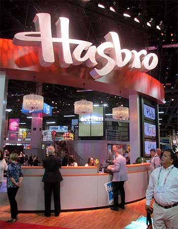
Photo by Jim Hill
And make no mistake about this. The Licensing Expo is all
about business. That point was clearly driven home at this year's show when —
as you walked through the doors of the Mandalay
Bay Convention Center
— the first thing that you saw was the Hasbros Booth. Which was this gleaming,
sleek two story-tall affair full of people who were negotiating deals &
signing contracts for all of the would-be summer blockbusters that have already
announced release dates for 2019 & beyond.

Photo by Jim Hill
"But what about The Walt Disney Company?," you
ask. "Weren't they represented on the show floor at this year's Licensing
Expo?" Not really, not. I mean, sure. There were a few companies there hyping
Disney-related products. Take — for example — the Disney Wikkeez people.
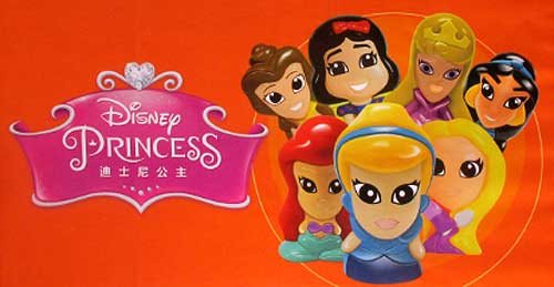
Photo by Jim Hill
I'm assuming that some Disney Consumer Products exec is
hoping that Wikkeez will eventually become the new Tsum Tsum. But to be blunt,
these little hard plastic figures don't seem to have the same huggable charm
that those stackable plush do. But I've been wrong before. So let's see what
happens with Disney Wikkeez once they start showing up on the shelves of the
Company's North American retail partners.

Photo by Jim Hill
And speaking of Disney's retail partners … They were
meeting with Mouse House executives behind closed doors one floor down from the
official show floor for this year's Licensing Expo.

Photo by Jim Hill
And the theme for this year's invitation-only Disney shindig? "Timeless
Stories" involving the Disney, Pixar, Marvel & Lucasfilm brands that
would then appeal to "tomorrow's consumer."

Photo by Jim Hill
And just to sort of hammer home the idea that Disney is no
longer the Company which cornered the market when it comes to little girls
(i.e., its Disney Princess and Disney Fairies franchises), check out this
wall-sized Star Wars-related image that DCP put up just outside of one of its
many private meeting rooms. "See?," this carefully crafted photo
screams. "It isn't just little boys who want to wield the Force. Little
girls also want to grow up and be Lords of the Sith."
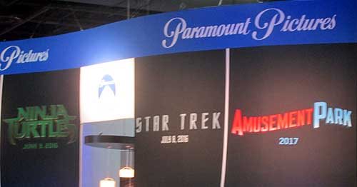
Photo by Jim Hill
One final, kind-of-ironic note: According to this banner,
Paramount Pictures will be releasing a movie called "Amusement Park"
to theaters sometime in 2017.

Photo by Jim Hill
Well, given all the "Blackfish" -related issues
that have been dogged SeaWorld Parks & Entertainment over the past two years, I'm
just hoping that they'll still be in the amusement park business come 2017.
Your thoughts?
General
It takes more than three circles to craft a Classic version of Mickey Mouse
You know what Mickey Mouse looks like, right? Little guy,
big ears?
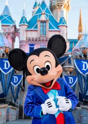
Truth be told, Disney's corporate symbol has a lot of
different looks. If Mickey's interacting with Guests at Disneyland
Park (especially this summer, when
the Happiest Place on Earth
is celebrating its 60th anniversary), he looks & dresses like this.
Copyright Disney Enterprises,
Inc.
All rights reserved
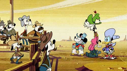
Or when he's appearing in one of those Emmy Award-winning shorts that Disney
Television Animation has produced (EX: "Bronco Busted," which debuts
on the Disney Channel tonight at 8 p.m. ET / PT), Mickey is drawn in a such a
way that he looks hip, cool, edgy & retro all at the same time.
Copyright Disney Enterprises, Inc. All rights
reserved
Looking ahead to 2017 now, when Disney Junior rolls out "Mickey and the
Roadster Racers," this brand-new animated series will feature a sportier version
of Disney's corporate symbol. One that Mouse House managers hope will persuade
preschool boys to more fully embrace this now 86 year-old character.

Copyright Disney Enterprises,
Inc. All rights reserved
That's what most people don't realize about the Mouse. The
Walt Disney Company deliberately tailors Mickey's look, even his style of
movement, depending on what sort of project / production he's appearing in.
Take — for example — Disney
California Adventure
Park's "World of Color:
Celebrate!" Because Disney's main mouse would be co-hosting this new
nighttime lagoon show with ace emcee Neil Patrick Harris, Eric Goldberg really had
to step up Mickey's game. Which is why this master Disney animator created
several minutes of all-new Mouse animation which then showed that Mickey was
just as skilled a showman as Neil was.

Copyright Disney Enterprises,
Inc.
All rights reserved
Better yet, let's take a look at what the folks at Avalanche Studios just went
through as they attempted to create a Classic version of Mickey & Minnie.
One that would then allow this popular pair to become part of Disney Infinity
3.0.
"I won't lie to you. We were under a lot of pressure to
get the look of this particular version of Mickey — he's called Red Pants
Mickey around here — just right," said Jeff Bunker, the VP of Art
Development at Avalanche Studios, during a recent phone interview. "When
we brought Sorcerer Mickey into Disney Infinity 1.0 back in January of 2014,
that one was relatively easy because … Well, everyone knows what Mickey Mouse
looked like when he appeared in 'Fantasia.' "

Copyright Disney Enterprises,
Inc. All rights reserved
"But this time around, we were being asked to design
THE Mickey & Minnie," Bunker continued. "And given that these Classic
Disney characters have been around in various different forms for the better
part of the last century … Well, which look was the right look?"
Which is why Jeff and his team at Avalanche Studios began watching hours &
hours of Mickey Mouse shorts. As they tried to get a handle on which look would
work best for these characters in Disney Infinity 3.0.

Copyright Disney
Enterprises, Inc. All rights reserved
"And we went all the way back to the very start of Mickey's career. We began
with 'Steamboat Willie' and then watched all of those black & white Mickey shorts
that Walt made back in the late 1920s & early 1930s. From there, we
transitioned to his Technicolor shorts. Which is when Mickey went from being
this pie-eyed, really feisty character to more of a well-behaved leading
man," Bunker recalled. "We then finished out our Mouse marathon by
watching all of those new Mickey shorts that Paul Rudish & his team have
been creating for Disney Television Animation. Those cartoons really recapture
a lot of the spirit and wild slapstick fun that Mickey's early, black &
white shorts had."
But given that the specific assignment that Avalanche Studios had been handed
was to create the most appealing looking, likeable version of Mickey Mouse
possible … In the end, Jeff and his team wound up borrowing bits & pieces
from a lot of different versions of the world's most famous mouse. So that
Classic Mickey would then look & move in a way that best fit the sort of
gameplay which people would soon be able to experience with Disney Infinity
3.0.

Copyright Disney Enterprises,
Inc. All rights reserved
"That — in a lot of ways — was actually the toughest
part of the Classic Mickey design project. You have to remember that one of the
key creative conceits of Disney Infinity
is that all the characters which appear in this game are toys," Bunker
stated. "Okay. So they're beautifully detailed, highly stylized toy
versions of beloved Disney, Pixar, Marvel & Lucasfilm characters. But
they're still supposed to be toys. So our Classic versions of Mickey &
Minnie have the same sort of thickness & sturdiness to them that toys have.
So that they'll then be able to fit right in with all of the rest of the
characters that Avalanche Studios had previously designed for Disney Infinity."
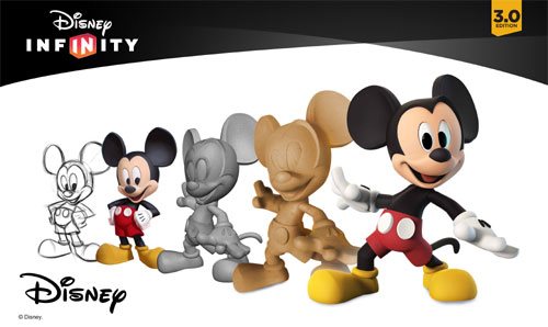
And then there was the matter of coming up with just the
right pose for Classic Mickey & Minnie. Which — to hear Jeff tell the
story — involved input from a lot of Disney upper management.
Copyright Disney Enterprises,
Inc. All rights reserved
"Everyone within the Company seemed to have an opinion
about how Mickey & Minnie should be posed. More to the point, if you Google
Mickey, you then discover that there are literally thousands of poses out there
for these two. Though — truth be told — a lot of those kind of play off the
way Mickey poses when he's being Disney's corporate symbol," Bunker said.
"But what I was most concerned about was that Mickey's pose had to work
with Minnie's pose. Because we were bringing the Classic versions of these
characters up into Disney Infinity 3.0 at the exact same time. And we wanted to
make sure — especially for those fans who like to put their Disney Infinity
figures on display — that Mickey's pose would then complement Minnie.
Which is why Jeff & the crew at Avalanche Studios
decided — when it came to Classic Mickey & Minnie's pose — that they
should go all the way back to the beginning. Which is why these two Disney icons
are sculpted in such a way that it almost seems as though you're witnessing the
very first time Mickey set eyes on Minnie.

Copyright Disney Enterprises,
Inc. All rights reserved
"And what was really great about that was — as soon as
we began showing people within the Company this pose — everyone at Disney
quickly got on board with the idea. I mean, the Classic Mickey that we sculpted
for Disney Infinity 3.0 is clearly a very playful, spunky character. But at the
same time, he's obviously got eyes for Minnie," Bunker concluded. "So
in the end, we were able to come up with Classic versions of these characters
that will work well within the creative confines of Disney Infinity 3.0 but at
the same time please those Disney fans who just collect these figures because
they like the way the Disney Infinity characters look."
So now that this particular design project is over, does
Jeff regret that Mouse House upper management was so hands-on when it came to
making sure that the Classic versions of Mickey & Minnie were specifically
tailored to fit the look & style of gameplay found in Disney Infinity 3.0?

Copyright Lucasfilm / Disney
Enterprises, Inc. All rights reserved
"To be blunt, we go through this every time we add a new character to the
game. The folks at Lucasfilm were just as hands-on when we were designing the
versions of Darth Vader and Yoda that will also soon be appearing in Disney
Infinity 3.0," Bunker laughed. "So in the end, if the character's
creators AND the fans are happy, then I'm happy."
This article was originally posted on the Huffington Post's Entertainment page on Tuesday, June 9, 2015
-

 Film & Movies11 months ago
Before He Was 626: The Surprisingly Dark Origins of Disney’s Stitch
-
 History9 months ago
California Misadventure
-
 Film & Movies10 months ago
The Best Disney Animation Film Never Made – “Chanticleer”
-

 Theme Parks & Themed Entertainment9 months ago
The ExtraTERRORestrial Files
-
 Television & Shows12 months ago
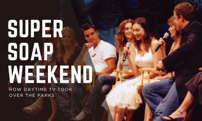
The Untold Story of Super Soap Weekend at Disney-MGM Studios: How Daytime TV Took Over the Parks
-

 History10 months ago
Why Disney’s Animal Kingdom’s Beastly Kingdom Was Never Built


