General
Wednesday with Wade: More “Making Fun of the Mouse”
Following up on Jim Hill's series from last week, Wade Sampson now shares some of his favorite stories about cartoons that parodied Walt Disney and/or the cartoons that his studio produced

Last week, Jim Hill did a three part article on animated cartoons that made fun of Disney.And thorough as Mr. Hill tried to be with his “Making Fun of the Mouse” series, Jim still managed to miss a few great stories, which I’d like to share with you now.
Let’s start where Jim started. With Warner Brothers’ 1943 short, "Pigs in a Polka." Yes, this Academy-Award nominated cartoon was indeed a parody of Disney"s "The Three Little Pigs." This short was directed by Friz Freleng, who had worked as an animator at the Disney Studios on the early black & white silent shorts and was fired by Walt for an incident that Friz still grumbled about decades later.
So obviously there was no love loss between Freleng & Disney when Friz directed this parody.In fact, during his tenure at Termite Terrace, Freleng managed to get in yet another poke at Disney’s Three Little Pigs with Warner Brothers’ 1957 cartoon, "Three Little Bops." This clever short is done in a Fifties'jazz and rock'n'rock style where all the dialogue is done in rhyme (all sung by the versatile Stan Freberg).In this version of the classic , the trumpet-playing wolf wants to join the Three Little Pigs trio but has to learn you have to get real hot to play real cool.
Getting back to "Pigs in a Polka" now … What many animation fans don’t realize is that Freleng’s “Three Little Pigs” parody was actually preceded by another cartoon that spoofed this Academy-Award winning short. Only this cartoon – 1942’s "Blitz Wolf" – was directed by the legendary Tex Avery. In fact, “Blitz Wolf” has the distinction of being the very cartoon that Tex directed after he left Warner Brothers to set up shop over at MGM.
Anyway … Avery went out of his way to make sure that “Blitz Wolf” was also an effective parody of Disney’s “Three Little Pigs.” Tex even went so far as to hire Pinto Colvig to do the voice of the Practical Pig character (called "Sergeant Pork" in this version as a parody of war hero "Sergeant York") just as Pinto had done in the Disney version of this classic fairy tale.
A very strong anti-Nazi cartoon, the title character in “Blitz Wolf” is "Der Fewer.” A blatant Hitler parody, Der Fewer betrays an non-aggression pact in order to invade Pigmania.He huffs and puffs away the straw & wood houses but then finds himself confronted with the Practical Pig's house which is a bunker with hundreds of cannons.There are some fairly strong sexual gags in this animated short. In particular one with some phallic missiles & a copy of "Esquire" magazine & a cheesecake picture.
Moving on to some of the other films that Mr. Hill touched on as part of last week’s “Making Fun of the Mouse” series … In the talkbacks for those articles, a few JHM readers unfairly criticized "Coal Black and De Sebben Dwarfs." To understand the true significance of this seldom-seen cartoon, I’d first suggest that you read Martin "Dr. Toon" Goodman's excellent article about “Coal Black.”
Better yet, if you live in the Los Angeles area, track down animator Milt Gray. Milt will not hesitate to educate you on the merits of this cartoon.More to the point, given that Mr. Gray knew Bob Clampett for many years, Milt will be glad to tell you that Bob was not a racist.And neither was “Coal Black” ‘s storyman Warren Foster.
Truth be told, the real origins of this classic cartoon parody came from Clampett's studying the caricatures in the book, "Harlem As Seen by Hirschfeld.”Hirschfeld's exaggerated artistic caricatures, of course, later inspired Disney animator Eric Goldberg's work on "Aladdin" and "Fantasia 2000.”
In addition, Clampett attended Duke Ellington's 1941 live musical revue, "Jump for Joy." After the show, Ellington & the cast suggested Clampett make a musical cartoon that focused on "black" music. To prep for this project, Clampett had his animation unit take a couple of field trips to "Club Alabam,” a Los Angeles area club that catered to African Americans. So that they could then get a feel for the music & the dancing that one often heard & saw when visiting a "black" nightclub.
To given “Coal Black” some additional authenticity, Clampett originally wanted an all-Black band to provide music for the short. But producer Leon Schlesinger nixed that idea refused for monetary reasons. Which is why the film was eventually scored by Carl Stalling.
But that didn’t stop Bob from trying to give this short an authentic “black” sound. Which is why Clampett eventually hired an all-black band — Eddie Beals and His Orchestra — to record the music for the “Waking up So White” sequence in the cartoon.
With the hope that having just the right voices for his characters might give “Coal Black” some additional authenticity, Bob even hired African American actors to perform the lead roles in his film. Clampett hired Vivian Dandridge (I.E. The sister of African American actress Dorothy Dandridge) to voice "So White" and then hired Ruby Dandridge (I.E. Dorothy & Vivian’s mother) to voice the wicked Queen. Bob even recruited Zoot Watson to do the voice of "Prince Chawmin" while Mel Blanc provided all of the other voices in the picture.
Now – over the years – many animation fans have wondered why this Bob Clampett cartoon is called "Coal Black and the Sebben Dwarfs" if the main character in the picture is referred to as "So White"?Well, producer Schlesinger feared that calling the cartoon "So White" would be just too close to the title of the Disney original. Which is why a change was eventually made in the cartoon’s title but not in the cartoon itself.
Most animation scholars and historians consider "Coal Black" an undisputed masterpiece for good reason.Animation is an exaggerated reality, especially in the world of Bob Clampett. And so the characters in the film were just as exaggerated and stereotyped as any other Clampett cartoon character. But there is a dignity and intelligence to the characters in "Coal Black" that somewhat offsets the racial images that were a common cartoon "shorthand" at the time.(Let’s not forget that several Mickey Mouse black and white cartoons that were made back in the 1930s also feature large lipped, savage, stupid cannibals, for instance.)
More importantly, “Coal Black” captures some of the high energy spirit of Black Culture of the time.Let me add that the Black performers who participated in the production of this cartoon found it hilariously entertaining. Just as Nick Stewart (AKA the voice of B’rer Bear in Disney’s “Song of the South”) was not embarrassed nor ashamed by his work in later years.
Unfortunately, back in the 1960s, this cartoon was consigned to the "Censored 11." Which meant that it wasn’t to be seen on television or in theaters. In spite of “Coal Black” ‘s many virtues, which included showing African Americans in uniform defending their country. Which is something that you usually didn’t see in motion pictures made during this time.
Moving on now to one of the other Disney parodies that Mr. Hill discussed as part of last week’s “Making Fun of the Mouse” series, “Beanyland” … Disney historian Jim Korkis was a friend of Clampett's and interviewed him extensively over the years. One of those interviews focusing on the "Beany and Cecil" animated show will be appearing in a forthcoming issue of "Hogan's Alley" (Issue #14, which is due out next month).
In exchange for giving “Hogan’s Alley” a rather gratuitous plug in today’s article ("Hogan's Alley" is an outstanding magazine, one that’s devoted to covering the history of animation & cartooning. Past issues have featured detailed interviews with Disney legends Bill Peet, Marc Davis and Ward Kimball. If you’d like to see why animation fans have been raving about “Hogan’s Alley,” for a limited time, you can pick up a sample back issue for half price! For further information, click on this link), I get to share an excerpt from Korkis’ upcoming interview with Clampett.
Looking back on this particular episode of “The Beany & Cecil Show,” Clampett recalled:
“ABC got very upset about ‘Beanyland’ because — of course — they had been running the ‘Disneyland’ television program and other Disney programs. And they didn’t want to make Walt mad because there were some legal things going on where Disney was leaving ABC.
“Oh, you can’t have a caricature of Walt Disney in there saying, ‘I’ll make this my DismalLand’!’I’d answer, “Where’s Walt Disney in there?The character with the hook nose and mustache is my longtime villain Dishonest John.Everybody knows who he is.”
My original version of “Beanyland” was very, very funny because it was such a tongue-in-cheek satire on Disneyland even as to the way they worded their advertising.Beany would say stuff like “Look, what he’s doing to my creamy, dreamy Beanyland!” And that made fun of those peanut butter commercials.
I had Dishonest John packaging the moon as cheese and bringing it back to Earth to sell it.On the package, I had the word “Krafty” and ABC was afraid the Kraft Cheese Company would sue them.It was those kinds of things they censored and so much more for seemingly no reason.This place wasn’t built by a mouse; it was built for mice!”
This story was later adapted for the April-June 1963 DELL "Beany & Cecil" comic book, which illustrated by Willie Ito, an artist who worked for Disney Feature Animation back in the 1950s. Where Ito helped animate the spaghetti-eating sequence in "Lady and the Tramp.” In the comic book version of this episode, they show a much more detailed map of "Beanyland." And it features a "Rock and Roller Coaster" & a "Go-Man Chinese Theater" decades before Disney actually built those attractions in Florida.
Getting now to another classic cartoon that Jim covered in his “Making Fun of the Mouse” series … Jay Ward's "Fractured Fairy Tales" version of "Sleeping BeautyLand" also has some Disney history behind it.It was directed by Bill Hurtz who joined Don Graham's life drawing class at Chouinard Art Institute when he was thirteen years old and got flustered by seeing a nude model for the first time.He joined the Disney Studios in 1938 and worked on "Pinocchio," "Fantasia" (the mushroom dance sequence) and "Dumbo.”When he went on strike with other Disney animators, he was fired and eventually wound up at UPA. In 1959, he became a senior director for Jay Ward's animation studio.
"(“Sleeping Beautyland”) was a take-off on Disneyland and I purposely caricatured the prince as Walt Disney and we had Daws Butler do his Phil Silvers type voice which was the standard sneaky but friendly con man," Hurtz told me when I was interviewing him for a never-published book about the Jay Ward cartoons.
Mind you, Ward didn’t only make fun of Walt Disney. As animation legend June Foray (Who did the voice of the princess & the evil fairy in this particular “Fractured Fairy Tale”) once told me: "Jay's cartoons offended nations, school teachers, weather bureaus, everyone."
In fact, Ward loved controversy and parodied historical figures, media celebrities, literary artists and any other visible targets. When actor Durwood Kirby threatened to sue over a "Rocky & Bullwinkle" item called the "Kurwood Derby,” Ward welcomed the attention to his struggling series.
There was the belief at the studio that the Disney parody where an "X coupon" would get you across the bridge of "Moat Land" in front of the castle, a "Y Coupon" would get you into "Entrance Hall Land" and a "Z Coupon" would get you up "Staircase Land" to see the Sleeping Beauty might raise the ire of the Disney Company and generate some publicity. But Disney chose to ignore the cartoon.
There are other classic cartoons out there that make fun of Disney films (I mean, how could Jim forget Marv Newland’s classic "Bambi Meets Godzilla?). But – given that Mr. Hill is supposedly already hard at work on yet another installment of his “Making Fun of the Mouse” series – I suppose we can overlook the few films that seem to have eluded his grasp so far.
General
Seward Johnson bronzes add a surreal, artistic touch to NYC’s Garment District

Greetings from NYC. Nancy and I drove down from New
Hampshire yesterday because we'll be checking out
Disney Consumer Products' annual Holiday Showcase later today.
Anyway … After checking into our hotel (i.e., The Paul.
Which is located down in NYC's NoMad district), we decided to grab some dinner.
Which is how we wound up at the Melt Shop.

Photo by Jim Hill
Which is this restaurant that only sells grilled cheese sandwiches.
This comfort food was delicious, but kind of on the heavy side.

Photo by Jim Hill
Which is why — given that it was a beautiful summer night
— we'd then try and walk off our meals. We started our stroll down by the Empire
State Building
…
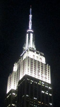
Photo by Jim Hill
… and eventually wound up just below Times
Square (right behind where the Waterford Crystal Times Square New
Year's Eve Ball is kept).

Photo by Jim Hill
But you know what we discovered en route? Right in the heart
of Manhattan's Garment District
along Broadway between 36th and 41st? This incredibly cool series of life-like
and life-sized sculptures that Seward
Johnson has created.

Photo by Jim Hill
And — yes — that is Abraham Lincoln (who seems to have
slipped out of WDW's Hall of Presidents when no one was looking and is now
leading tourists around Times Square). These 18 painted
bronze pieces (which were just installed late this past Sunday night / early
Monday morning) range from the surreal to the all-too-real.
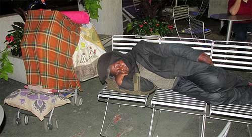
Photo by Jim Hill
Some of these pieces look like typical New Yorkers. Like the
business woman planning out her day …

Photo by Jim Hill
… the postman delivering the mail …

Photo by Jim Hill
… the hot dog vendor working at his cart …

Photo by Jim Hill
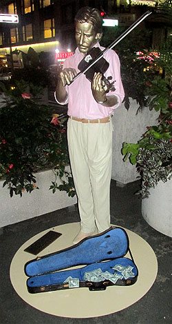
Photo by Jim Hill
… the street musician playing for tourists …

Photo by Jim Hill
Not to mention the tourists themselves.
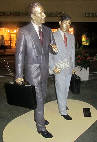
Photo by Jim Hill
But right alongside the bronze businessmen …

Photo by Jim Hill
… and the tired grandmother hauling her groceries home …
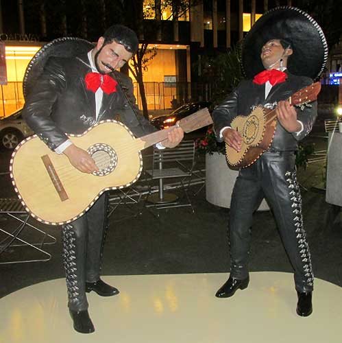
Photo by Jim Hill
… there were also statues representing people who were
from out-of-town …

Photo by Jim Hill
… or — for that matter — out-of-time.

Photo by Jim Hill
These were the Seward Johnson pieces that genuinely beguiled. Famous impressionist paintings brought to life in three dimensions.

Note the out-of-period water bottle that some tourist left
behind. Photo by Jim Hill
Some of them so lifelike that you actually had to pause for
a moment (especially as day gave way to night in the city) and say to yourself
"Is that one of the bronzes? Or just someone pretending to be one of these
bronzes?"
Mind you, for those of you who aren't big fans of the
impressionists …

Photo by Jim Hill
… there's also an array of American icons. Among them
Marilyn Monroe …
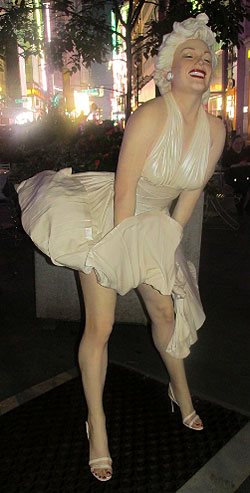
Photo by Jim Hill
… and that farmer couple from Grant Wood's "American
Gothic."

Photo by Jim Hill
But for those of you who know your NYC history, it's hard to
beat that piece which recreates Alfred Eisenstaedt's famous photograph of V-J Day in Times Square.

Photo by Jim Hill
By the way, a 25-foot-tall version of this particular Seward
Johnson piece ( which — FYI — is entitled "Embracing Peace") will actually
be placed in Times Square for a few days on or around August 14th to commemorate the 70th
anniversary of Victory Over Japan Day (V-J Day).

Photo by Jim Hill
By the way, if you'd like to check these Seward Johnson bronzes in
person (which — it should be noted — are part of the part of the Garment
District Alliance's new public art offering) — you'd best schedule a trip to
the City sometime over the next three months. For these pieces will only be on
display now through September 15th.
General
Wondering what you should “Boldly Go” see at the movies next year? The 2015 Licensing Expo offers you some clues
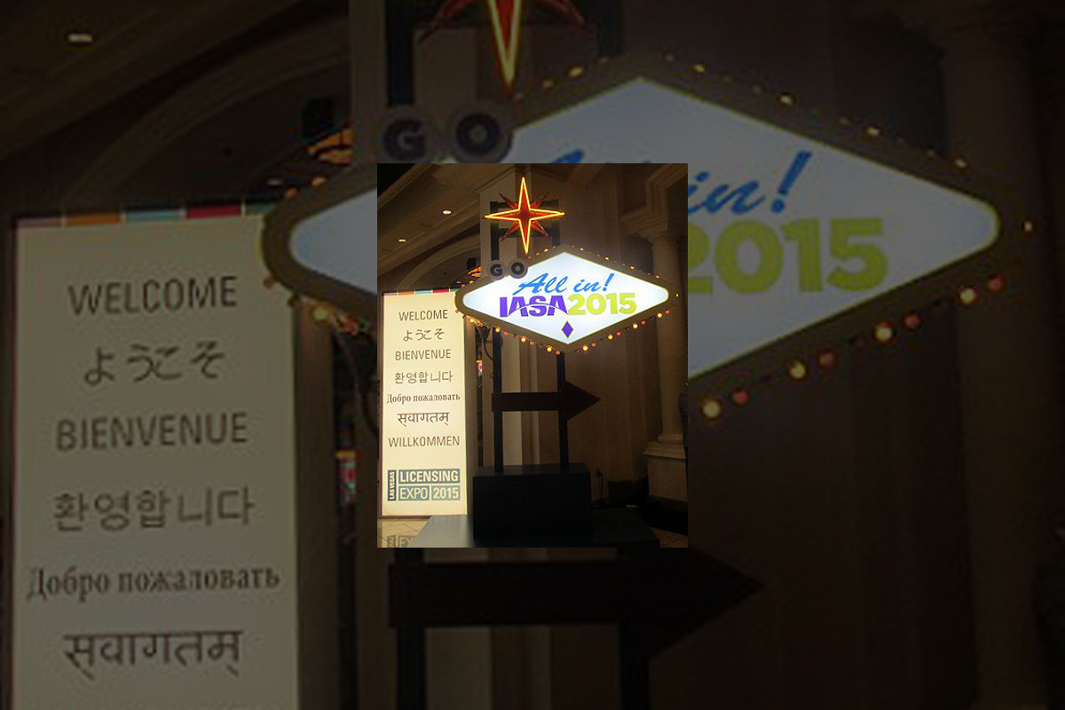
Greeting from the 2015 Licensing Expo, which is being held
at the Mandalay Bay
Convention Center in Las
Vegas.

Photo by Jim Hill
I have to admit that I enjoy covering the Licensing Expo.
Mostly becomes it allows bloggers & entertainment writers like myself to
get a peek over the horizon. Scope out some of the major motion pictures &
TV shows that today's vertically integrated entertainment conglomerates
(Remember when these companies used to be called movie studios?) will be
sending our way over the next two years or so.
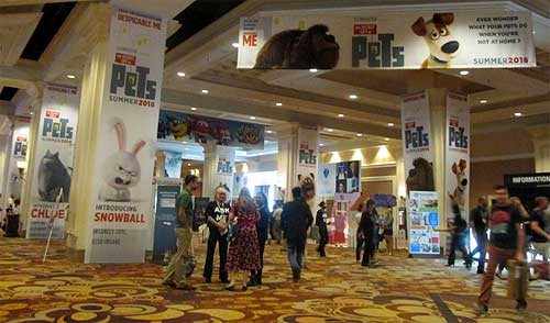
Photo by Jim Hill
Take — for example — all of "The Secret Life of
Pets" banners that greeted Expo attendees as they made their way to the
show floor today. I actually got to see some footage from this new Illumination
Entertainment production (which will hit theaters on July 8, 2016) the last time I was in Vegas. Which
was for CinemaCon back in April. And the five or so minutes of film that I viewed
suggested that "The Secret Life of Pets" will be a really funny
animated feature.

Photo by Jim Hill
Mind you, Universal Pictures wanted to make sure that Expo
attendees remembered that there was another Illumination Entertainment production
coming-to-a-theater-near-them before "The Secret Life of Pets" (And
that's "Minions," the "Despicable Me" prequel. Which
premieres at the Annecy International Animated Film Festival next week but
won't be screened stateside 'til July 10th of this year). Which is why they had
three minions who were made entirely out of LEGOS loitering out in the lobby.

Photo by Jim Hill
And Warner Bros. — because they wanted "Batman v
Superman: Dawn of Justice" to start trending on Twitter today — brought
the Batmobile to Las Vegas.
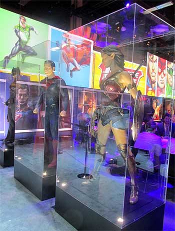
Photo by Jim Hill
Not to mention full-sized macquettes of Batman, Superman and
Wonder Woman. Just so conventioneers could then see what these DC superheroes
would actually look like in this eagerly anticipated, March 25, 2016 release.

Photo by Jim Hill
That's the thing that can sometimes be a wee bit frustrating
about the Licensing Expo. It's all about delayed gratification. You'll come
around a corner and see this 100 foot-long ad for "The Peanuts Movie"
and think "Hey, that looks great. I want to see that Blue Sky Studios production
right now." It's only then that you notice the fine print and realize that
"The Peanuts Movie" doesn't actually open in theaters 'til November
6th of this year.

Photo by Jim Hill
And fan of Blue Sky's "Ice Age" film franchise are in for an even
longer wait. Given that the latest installment in that top grossing series
doesn't arrive in theaters 'til July
15, 2016.

Photo by Jim Hill
Of course, if you're one of those people who needs immediate
gratification when it comes to your entertainment, there was stuff like that to
be found at this year's Licensing Expo. Take — for example — how the WWE
booth was actually shaped like a wrestling ring. Which — I'm guessing — meant
that if the executives of World Wrestling Entertainment, Inc. didn't like
the offer that you were making, they were then allowed to toss you out over the
top rope, Royal Rumble-style.

Photo by Jim Hill
I also have to admit that — as a longtime Star Trek fan —
it was cool to see the enormous Starship Enterprise that hung in place over the
CBS booth. Not to mention getting a glimpse of the official Star Trek 50th
Anniversary logo.
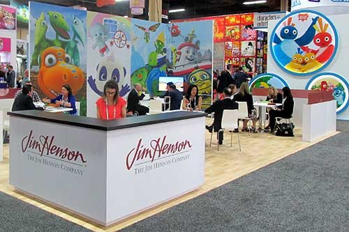
Photo by Jim Hill
I was also pleased to see lots of activity in The Jim Henson
Company booth. Which suggests that JHC has actually finally carved out a
post-Muppets identity for itself.

Photo by Jim Hill
Likewise for all of us who were getting a little concerned
about DreamWorks Animation (what with all the layoffs & write-downs &
projects that were put into turnaround or outright cancelled last year), it was
nice to see that booth bustling.

Photo by Jim Hill
Every so often, you'd come across some people who were
promoting a movie that you weren't entirely sure that you actually wanted to
see (EX: "Angry Birds," which Sony Pictures Entertainment / Columbia
Pictures will be releasing to theaters on May 20, 2016). But then you remembered that Clay Kaytis —
who's this hugely talented former Walt Disney Animation Studios animator — is
riding herd on "Angry Birds" with Fergal Reilly. And you'd think
"Well, if Clay's working on 'Angry Birds,' I'm sure this animated feature
will turn out fine."

Photo by Jim Hill
Mind you, there were reminders at this year's Licensing Expo
of great animated features that we're never going to get to see now. I still
can't believe — especially after that brilliant proof-of-concept footage
popped up online last year — that Sony execs decided not to go forward
with production of Genndy Tartakovsky's
"Popeye" movie. But that's the
cruel thing about the entertainment business, folks. It will sometime break
your heart.
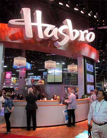
Photo by Jim Hill
And make no mistake about this. The Licensing Expo is all
about business. That point was clearly driven home at this year's show when —
as you walked through the doors of the Mandalay
Bay Convention Center
— the first thing that you saw was the Hasbros Booth. Which was this gleaming,
sleek two story-tall affair full of people who were negotiating deals &
signing contracts for all of the would-be summer blockbusters that have already
announced release dates for 2019 & beyond.

Photo by Jim Hill
"But what about The Walt Disney Company?," you
ask. "Weren't they represented on the show floor at this year's Licensing
Expo?" Not really, not. I mean, sure. There were a few companies there hyping
Disney-related products. Take — for example — the Disney Wikkeez people.
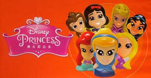
Photo by Jim Hill
I'm assuming that some Disney Consumer Products exec is
hoping that Wikkeez will eventually become the new Tsum Tsum. But to be blunt,
these little hard plastic figures don't seem to have the same huggable charm
that those stackable plush do. But I've been wrong before. So let's see what
happens with Disney Wikkeez once they start showing up on the shelves of the
Company's North American retail partners.

Photo by Jim Hill
And speaking of Disney's retail partners … They were
meeting with Mouse House executives behind closed doors one floor down from the
official show floor for this year's Licensing Expo.

Photo by Jim Hill
And the theme for this year's invitation-only Disney shindig? "Timeless
Stories" involving the Disney, Pixar, Marvel & Lucasfilm brands that
would then appeal to "tomorrow's consumer."

Photo by Jim Hill
And just to sort of hammer home the idea that Disney is no
longer the Company which cornered the market when it comes to little girls
(i.e., its Disney Princess and Disney Fairies franchises), check out this
wall-sized Star Wars-related image that DCP put up just outside of one of its
many private meeting rooms. "See?," this carefully crafted photo
screams. "It isn't just little boys who want to wield the Force. Little
girls also want to grow up and be Lords of the Sith."
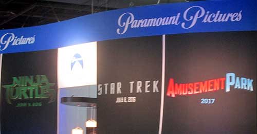
Photo by Jim Hill
One final, kind-of-ironic note: According to this banner,
Paramount Pictures will be releasing a movie called "Amusement Park"
to theaters sometime in 2017.

Photo by Jim Hill
Well, given all the "Blackfish" -related issues
that have been dogged SeaWorld Parks & Entertainment over the past two years, I'm
just hoping that they'll still be in the amusement park business come 2017.
Your thoughts?
General
It takes more than three circles to craft a Classic version of Mickey Mouse
You know what Mickey Mouse looks like, right? Little guy,
big ears?
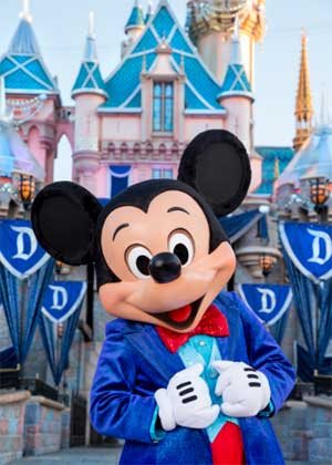
Truth be told, Disney's corporate symbol has a lot of
different looks. If Mickey's interacting with Guests at Disneyland
Park (especially this summer, when
the Happiest Place on Earth
is celebrating its 60th anniversary), he looks & dresses like this.
Copyright Disney Enterprises,
Inc.
All rights reserved
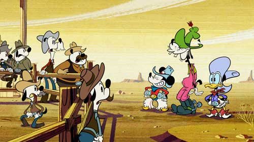
Or when he's appearing in one of those Emmy Award-winning shorts that Disney
Television Animation has produced (EX: "Bronco Busted," which debuts
on the Disney Channel tonight at 8 p.m. ET / PT), Mickey is drawn in a such a
way that he looks hip, cool, edgy & retro all at the same time.
Copyright Disney Enterprises, Inc. All rights
reserved
Looking ahead to 2017 now, when Disney Junior rolls out "Mickey and the
Roadster Racers," this brand-new animated series will feature a sportier version
of Disney's corporate symbol. One that Mouse House managers hope will persuade
preschool boys to more fully embrace this now 86 year-old character.

Copyright Disney Enterprises,
Inc. All rights reserved
That's what most people don't realize about the Mouse. The
Walt Disney Company deliberately tailors Mickey's look, even his style of
movement, depending on what sort of project / production he's appearing in.
Take — for example — Disney
California Adventure
Park's "World of Color:
Celebrate!" Because Disney's main mouse would be co-hosting this new
nighttime lagoon show with ace emcee Neil Patrick Harris, Eric Goldberg really had
to step up Mickey's game. Which is why this master Disney animator created
several minutes of all-new Mouse animation which then showed that Mickey was
just as skilled a showman as Neil was.

Copyright Disney Enterprises,
Inc.
All rights reserved
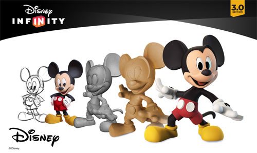
Better yet, let's take a look at what the folks at Avalanche Studios just went
through as they attempted to create a Classic version of Mickey & Minnie.
One that would then allow this popular pair to become part of Disney Infinity
3.0.
"I won't lie to you. We were under a lot of pressure to
get the look of this particular version of Mickey — he's called Red Pants
Mickey around here — just right," said Jeff Bunker, the VP of Art
Development at Avalanche Studios, during a recent phone interview. "When
we brought Sorcerer Mickey into Disney Infinity 1.0 back in January of 2014,
that one was relatively easy because … Well, everyone knows what Mickey Mouse
looked like when he appeared in 'Fantasia.' "

Copyright Disney Enterprises,
Inc. All rights reserved
"But this time around, we were being asked to design
THE Mickey & Minnie," Bunker continued. "And given that these Classic
Disney characters have been around in various different forms for the better
part of the last century … Well, which look was the right look?"
Which is why Jeff and his team at Avalanche Studios began watching hours &
hours of Mickey Mouse shorts. As they tried to get a handle on which look would
work best for these characters in Disney Infinity 3.0.

Copyright Disney
Enterprises, Inc. All rights reserved
"And we went all the way back to the very start of Mickey's career. We began
with 'Steamboat Willie' and then watched all of those black & white Mickey shorts
that Walt made back in the late 1920s & early 1930s. From there, we
transitioned to his Technicolor shorts. Which is when Mickey went from being
this pie-eyed, really feisty character to more of a well-behaved leading
man," Bunker recalled. "We then finished out our Mouse marathon by
watching all of those new Mickey shorts that Paul Rudish & his team have
been creating for Disney Television Animation. Those cartoons really recapture
a lot of the spirit and wild slapstick fun that Mickey's early, black &
white shorts had."
But given that the specific assignment that Avalanche Studios had been handed
was to create the most appealing looking, likeable version of Mickey Mouse
possible … In the end, Jeff and his team wound up borrowing bits & pieces
from a lot of different versions of the world's most famous mouse. So that
Classic Mickey would then look & move in a way that best fit the sort of
gameplay which people would soon be able to experience with Disney Infinity
3.0.

Copyright Disney Enterprises,
Inc. All rights reserved
"That — in a lot of ways — was actually the toughest
part of the Classic Mickey design project. You have to remember that one of the
key creative conceits of Disney Infinity
is that all the characters which appear in this game are toys," Bunker
stated. "Okay. So they're beautifully detailed, highly stylized toy
versions of beloved Disney, Pixar, Marvel & Lucasfilm characters. But
they're still supposed to be toys. So our Classic versions of Mickey &
Minnie have the same sort of thickness & sturdiness to them that toys have.
So that they'll then be able to fit right in with all of the rest of the
characters that Avalanche Studios had previously designed for Disney Infinity."
And then there was the matter of coming up with just the
right pose for Classic Mickey & Minnie. Which — to hear Jeff tell the
story — involved input from a lot of Disney upper management.
Copyright Disney Enterprises,
Inc. All rights reserved
"Everyone within the Company seemed to have an opinion
about how Mickey & Minnie should be posed. More to the point, if you Google
Mickey, you then discover that there are literally thousands of poses out there
for these two. Though — truth be told — a lot of those kind of play off the
way Mickey poses when he's being Disney's corporate symbol," Bunker said.
"But what I was most concerned about was that Mickey's pose had to work
with Minnie's pose. Because we were bringing the Classic versions of these
characters up into Disney Infinity 3.0 at the exact same time. And we wanted to
make sure — especially for those fans who like to put their Disney Infinity
figures on display — that Mickey's pose would then complement Minnie.
Which is why Jeff & the crew at Avalanche Studios
decided — when it came to Classic Mickey & Minnie's pose — that they
should go all the way back to the beginning. Which is why these two Disney icons
are sculpted in such a way that it almost seems as though you're witnessing the
very first time Mickey set eyes on Minnie.

Copyright Disney Enterprises,
Inc. All rights reserved
"And what was really great about that was — as soon as
we began showing people within the Company this pose — everyone at Disney
quickly got on board with the idea. I mean, the Classic Mickey that we sculpted
for Disney Infinity 3.0 is clearly a very playful, spunky character. But at the
same time, he's obviously got eyes for Minnie," Bunker concluded. "So
in the end, we were able to come up with Classic versions of these characters
that will work well within the creative confines of Disney Infinity 3.0 but at
the same time please those Disney fans who just collect these figures because
they like the way the Disney Infinity characters look."
So now that this particular design project is over, does
Jeff regret that Mouse House upper management was so hands-on when it came to
making sure that the Classic versions of Mickey & Minnie were specifically
tailored to fit the look & style of gameplay found in Disney Infinity 3.0?
Copyright Lucasfilm / Disney
Enterprises, Inc. All rights reserved
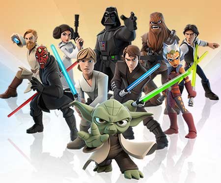
"To be blunt, we go through this every time we add a new character to the
game. The folks at Lucasfilm were just as hands-on when we were designing the
versions of Darth Vader and Yoda that will also soon be appearing in Disney
Infinity 3.0," Bunker laughed. "So in the end, if the character's
creators AND the fans are happy, then I'm happy."
This article was originally posted on the Huffington Post's Entertainment page on Tuesday, June 9, 2015
-

 Film & Movies11 months ago
Before He Was 626: The Surprisingly Dark Origins of Disney’s Stitch
-
 History9 months ago
California Misadventure
-
 Film & Movies10 months ago
The Best Disney Animation Film Never Made – “Chanticleer”
-

 Theme Parks & Themed Entertainment9 months ago
The ExtraTERRORestrial Files
-
 Television & Shows11 months ago
The Untold Story of Super Soap Weekend at Disney-MGM Studios: How Daytime TV Took Over the Parks
-

 History10 months ago
Why Disney’s Animal Kingdom’s Beastly Kingdom Was Never Built
-

 Podcast12 months ago
Epic Universal Podcast – Aztec Dancers, Mariachis, Tequila, and Ceremonial Sacrifices?! (Ep. 45)


